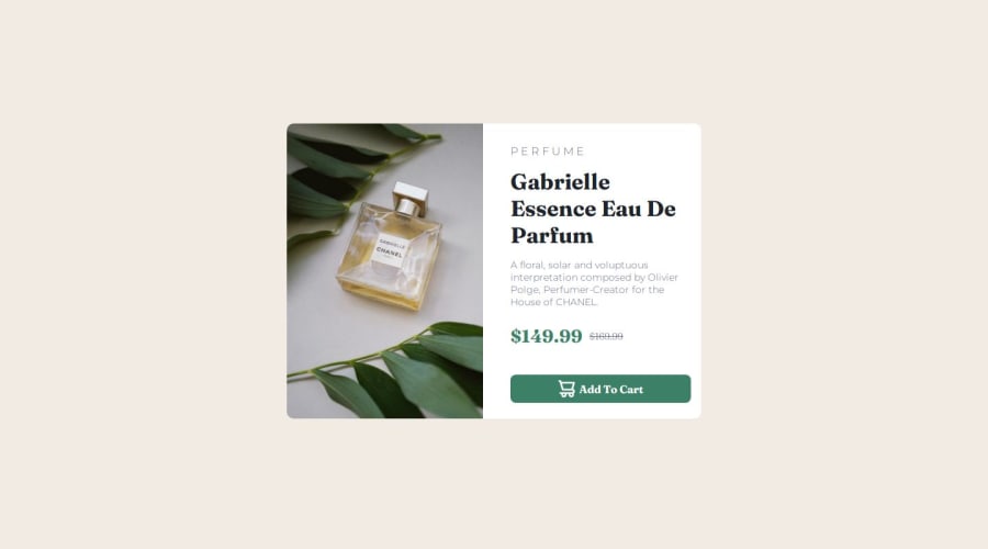


Design comparison

Solution retrospective
Proud that iv finished it in 2 hours
What challenges did you encounter, and how did you overcome them?handling responsive in for different sizes
What specific areas of your project would you like help with?responsive design
Community feedback
- @ActuallyWIKKOPosted 11 months ago
This looks like a solid attempt at the challenge. Well done.
Going through the code and testing the element I would recommend some adjustments:
- element width, spacing and line heights are a little off. -> I would set a fixed width for the element to get closer to the design -> pay close attention to the spacing between the elements -> add more padding to the right hand side, balance that with the gap towards the image
You didn't use a button element to make the button. I would recommend using that instead of constructing it with a div element.
Like this: <button id="addToCart"></button>
I would also add the SVG into the code to make it maintainable. This gives you a bit more flexibility to change it up. My solution for the button looks like this:
<button id="addToCart"><svg width="16" height="16" xmlns="http://www.w3.org/2000/svg"><path d="M14.383 10.388a2.397 2.397 0 0 0-1.518-2.222l1.494-5.593a.8.8 0 0 0-.144-.695.8.8 0 0 0-.631-.28H2.637L2.373.591A.8.8 0 0 0 1.598 0H0v1.598h.983l1.982 7.4a.8.8 0 0 0 .799.59h8.222a.8.8 0 0 1 0 1.599H1.598a.8.8 0 1 0 0 1.598h.943a2.397 2.397 0 1 0 4.507 0h1.885a2.397 2.397 0 1 0 4.331-.376 2.397 2.397 0 0 0 1.12-2.021ZM11.26 7.99H4.395L3.068 3.196h9.477L11.26 7.991Zm-6.465 6.392a.8.8 0 1 1 0-1.598.8.8 0 0 1 0 1.598Zm6.393 0a.8.8 0 1 1 0-1.598.8.8 0 0 1 0 1.598Z" fill="#FFF"/></svg> Add to Cart</button>
I wouldn't use the display: none for the switching images for desktop and mobile. There is a inline alternative that is just 4 lines of code:
<picture> <source srcset="./images/image-product-mobile.jpg" media="(max-width: 600px)"> <img src="./images/image-product-desktop.jpg" alt="parfume"> </picture>I know you where just testing this out but I would not use the media queries the way you did. Sometimes it's better to not overdo it. Use one or two to adjust for certain sizes and one to get the landscape view correct. Matter of fact is a user will not see these transitions you can test on desktop browsers. They will just see the website on the screen they have.
0@yosefHeshamPosted 11 months ago@ActuallyWIKKO Hello, thanks for your feedback The point about fixed width, you mean about the product card?
0@ActuallyWIKKOPosted 11 months ago@yosefHesham I meant to say you can give the element a max-width to help size it to the correct proportion. I used a value around 560px for Desktop and 360px for mobile.
0

Please log in to post a comment
Log in with GitHub
Join our Discord community
Join thousands of Frontend Mentor community members taking the challenges, sharing resources, helping each other, and chatting about all things front-end!
Join our Discord