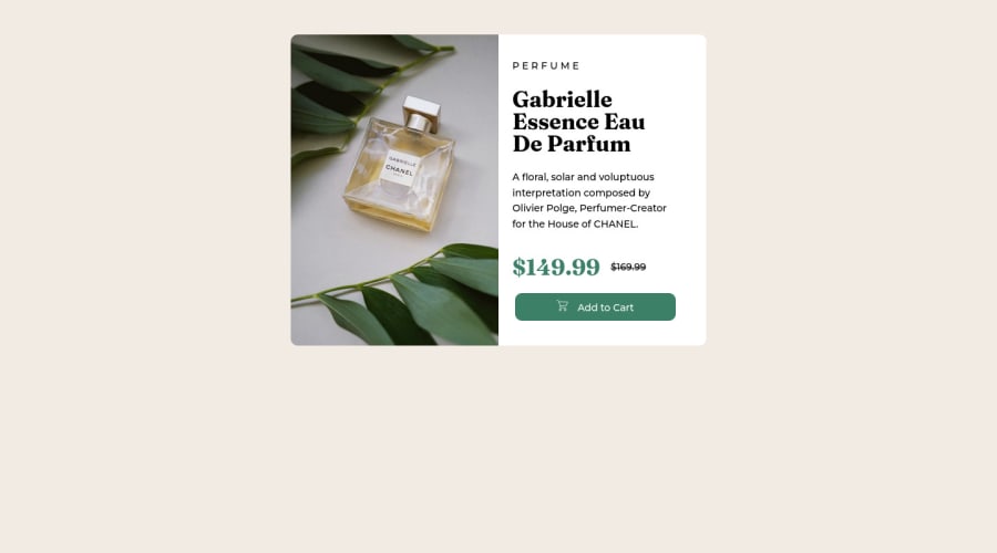
Product card with HTML and CSS Solution
Design comparison
Solution retrospective
Hello everyone. Long time haven't code anything. So, trying to remind myself basics. I'd be happy to get some feedback
Community feedback
- @AdrianoEscarabotePosted about 2 years ago
Hi Anastasiia Pushkareva, how are you?
Welcome to the front-end mentor community!
I really liked the result of your project, but I have some tips that I think you will enjoy:
- every Html document must contain the main tag, so we can identify the main content, to fix this, wrap all the content with the main tag. HTML5 landmark elements are used to improve navigation experience on your site for users of assistive technology.
- To align some content in the center of the screen, always prefer to use
display: flex;
it will make the layout more responsive!
Example:
body { margin: 0; padding: 0; display: flex; align-items: center; justify-content: center; min-height: 100vh; }
The rest is great!
I hope it helps... 👍
Marked as helpful0@AnastasiiaPushkarevPosted about 2 years ago@AdrianoEscarabote Thank you, Adriano! This is really great feedback! So helpful! You're doing amazing job! Thank you so much!
0@AdrianoEscarabotePosted about 2 years ago@AnastasiiaPushkarev no problem, keep coding!!
0 - @mizek1Posted about 2 years ago
Hi, great job! I suggest that you search about <picture> when you have different conditions to show images, it works very well when you have this case where you need to show an image on desktop size and another image on mobile size. Try to use more semantic tags, like <section> or <aside>, they work like a <div> but can make your blocks more meaningful.
Marked as helpful0@AnastasiiaPushkarevPosted about 2 years ago@mizek1 Thank you Danilo Alves. I really appreciate your feedback and I'll check all information about semantic tags and picture tag. Thank you again!
1 - @hernanruscicaPosted about 2 years ago
hello AnastasiiaPushkarev. First of all, congratulations on coming back to the frontend world and welcome to this platform. The page looks great, very similar to the required design, although the vertical centering would be missing. About the code, don't forget to use the semantic tags, not only divs... the css code is also very good, I would only add that you can use "custom variables", to better control the possible different layouts. "Custom variables" would be very useful for making "night" and "day" versions. Overall the project is very well completed. Greetings and I hope you like the comment.
Marked as helpful0@AnastasiiaPushkarevPosted about 2 years ago@hernanruscica Thank you so much! Your feedback is vry important for me! And I vas surprized how quick you replied!
1
Please log in to post a comment
Log in with GitHubJoin our Discord community
Join thousands of Frontend Mentor community members taking the challenges, sharing resources, helping each other, and chatting about all things front-end!
Join our Discord