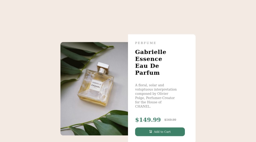
Design comparison
Solution retrospective
Hi guys, please let me know about my code.
Community feedback
- @KirthGersenClonePosted almost 2 years ago
Hi there,
the first thing that come to mind are the fonts you are using in your solution. Put following lines at the very top of your css: @import url("https://fonts.googleapis.com/css2?family=Montserrat:wght@500;700&display=swap"); @import url("https://fonts.googleapis.com/css2?family=Fraunces:opsz,[email protected],700&display=swap");
Secondly check out the "Josh Comeau CSS reset" it did wonders for me.
I am just beginning to get to know flex and grid, but when I look at your solution maybe you could put the two parts of your card as parts of a flexbox or gridbox.
0
Please log in to post a comment
Log in with GitHubJoin our Discord community
Join thousands of Frontend Mentor community members taking the challenges, sharing resources, helping each other, and chatting about all things front-end!
Join our Discord
