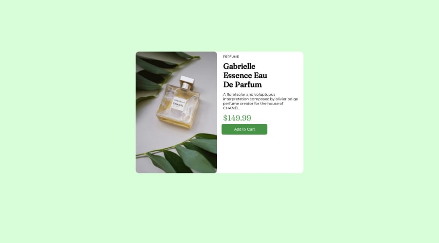
Design comparison
Solution retrospective
it was my first project it was a little hard and even tho I still don't know most of things i did i jutst had bits of knowledge and i just played around to get the final result this project is not responsive. but in future i will improve and this is just my first project.
Community feedback
- @kudos2ShefPosted over 1 year ago
Hi @heykarannn, Congratulations on completing your first challenge! This is perfect. Just writing this so that you don't have trouble after this like i had, this was my first project as well. To get the desired background color , text color, font-size or font-weight refer to style-guide. example:
:root{
	--Dark_grayish_blue: hsl(228, 12%, 48%);
	--cream:hsl(30, 38%, 92%);

}
h1 {
        font-family: "Fraunces", serif;
        font-weight: 700;
        color: var(--Very_dark_blue);
      }
Also remove
margin: auto;,margin-top: 170px;from .container use flex in body to center items. Example:body { display: flex; align-items: center; justify-content: center; min-height: 100vh; background-color: var(--cream); }Apply
box-sizing: border-box;to all elements.* { margin: 0; padding: 0; box-sizing: border-box; }First project is always special! Congratulations again! Happy Coding.
0
Please log in to post a comment
Log in with GitHubJoin our Discord community
Join thousands of Frontend Mentor community members taking the challenges, sharing resources, helping each other, and chatting about all things front-end!
Join our Discord
