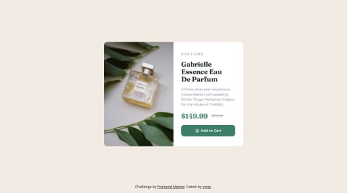
Product card using flexbox & SCSS

Solution retrospective
learned something valuable as i didn't know about the element, actually had the same problem in a personal project of mine so will be going back and retooling it to use that
What challenges did you encounter, and how did you overcome them?how to change the picture on desktop vs mobile, found some guidance in the frontend mentor discord
What specific areas of your project would you like help with?felt kinda iffy on setting the max-width of the card? also what do i do when the window gets REALLY small (like when im using responsive dimensions in devtools and i just keep making the preview thinner and thinner) because that just shrinks the card and it doesnt really stop shrinking.
Please log in to post a comment
Log in with GitHubCommunity feedback
No feedback yet. Be the first to give feedback on irene's solution.
Join our Discord community
Join thousands of Frontend Mentor community members taking the challenges, sharing resources, helping each other, and chatting about all things front-end!
Join our Discord