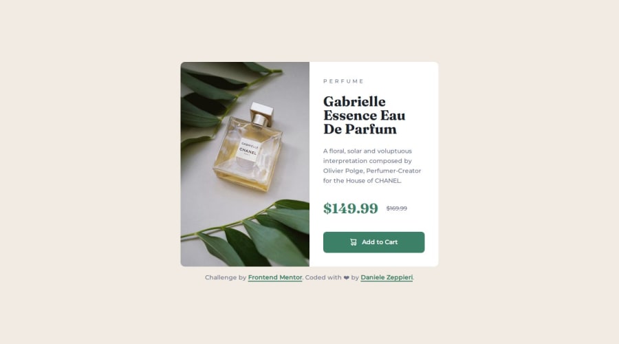


Design comparison

Solution retrospective
This challenge was the first time that I used fluid spacing and everything works fine, I'm also proud of the responsive grid layout without using media queries, I know it is a simple two-column layout but I never made it without media queries.
What challenges did you encounter, and how did you overcome them?I didn't encounter any particular challenge for this project, just a small problem with the image that didn't fill the container properly, I explain that in more detail down below.
What specific areas of your project would you like help with?When I become on the larger device the element fills the container properly while the doesn't, there is a small padding on the bottom, I think because the right side has padding all around.
By myself, I opted to set the eight: 100% on the img.
I would like to know if this solution is fine or if there is a better solution to use.
Thanks a million in advance ✌️
Cheers 😎 Daniele
Community feedback
- P@makogeborisPosted 8 months ago
Hi dedo-dev great work, if you change the media declaration of the
sourcefrom(min-width: 48em)to(min-width: 37.94em)exactly when the layout changes you wouldn't need to set the height to 100%.0P@dedo-devPosted 8 months ago@mkboris thanks for your reply, unfortunately, this doesn't work.
I tried it before, but the problem is the
paddingon the.product-card__contentwhich makes the container bigger and then<img>doesn't fill completely, while the<picture>tag does so.I tried everything or almost everything,
object-fit,object-position, media declaration, I set1xat the end of the<source>but nothing, only setting upheight: 100%to the `<img> works and I think that isn't the best solution 😓I can't understand why because the original height of the image is 900px while the card is less than 500px
Now I left the preview with this problem if you wanna give it a look.
Thank ✌️
0

Please log in to post a comment
Log in with GitHub
Join our Discord community
Join thousands of Frontend Mentor community members taking the challenges, sharing resources, helping each other, and chatting about all things front-end!
Join our Discord