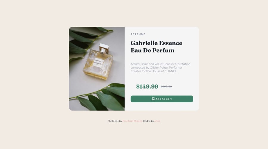
Design comparison
Community feedback
- @NehalSahu8055Posted about 1 year ago
Hello Coder 👋.
Congratulations on successfully completing the challenge! 🎉
Few suggestions regarding design.
- Use Semantics for the proper design of your code.
<body> <main>... main content goes here ...</main> <footer>... .attribution div goes here ... </footer> </body>- It would be better if you use source media for switching to screen sizes(mobile or desktop) for image.
<picture> <source media="(min-width:800px)" srcset="yourimage.jpg"> <img src="yourimage.jpg" alt="description"> </picture>-
For
non-decorative imagesgive meaningful and descriptive alt likealt= "Gabrielle Chanel Perfume bottle surrounded by leaves.". -
Use semantic element for strike-through
<s>$169.99</s> -
If you want to dive into
accessibilityfor this project check this link
I hope you find this helpful.
Happy coding😄
0 - @irenanrodriguesPosted about 1 year ago
Oi Ana, tudo bem? Parabéns por completar o desafio. Tenho uma dica para usar no seu código.
Você pode usar a tag <picture>, para fazer suas imagens ficarem mais dinâmicas aos tamanhos de tela. Tem esse vídeo do Prof. Guanabara que explica bem como funciona.
0
Please log in to post a comment
Log in with GitHubJoin our Discord community
Join thousands of Frontend Mentor community members taking the challenges, sharing resources, helping each other, and chatting about all things front-end!
Join our Discord
