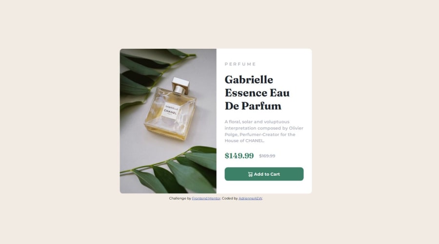
Design comparison
Solution retrospective
Sticking to the basics and using only html, CSS without any frameworks. I'm self-taught and more of an advanced intermediate developer. Well that's how I see it. I've been using GitHub for years, but still don't really understand it so this challenge was a great opportunity to learn more and acquire a deeper understanding of GitHub.
What challenges did you encounter, and how did you overcome them?Choosing between flexbox and grid. I went with flexbox because it seemed to be the best way to write less code. Getting the different branches and updates to work in GitHub took longer then coding the challenge.
This solution doesn't have a bunch of break points as it's only one card. However, I do wonder if using a few more break points would make the card more visually appealing across all device sizes.
What specific areas of your project would you like help with?Is flexbox really the best layout for this? And I wasn't sure about he 1400px measurement, was it suppose to be on the main container of the element or the card. A 1400px card doesn't seem to be visually appealing.
Community feedback
Please log in to post a comment
Log in with GitHubJoin our Discord community
Join thousands of Frontend Mentor community members taking the challenges, sharing resources, helping each other, and chatting about all things front-end!
Join our Discord
