Submitted 9 days ago
product-card-review usin responsive design technique

@Dannyx-huberf

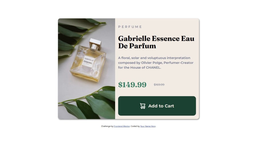
Design comparison
SolutionDesign

Community feedback
- P@klhaugPosted 8 days ago
Hey! You're well on your way here.
Some things you could check out to improve your solution:
- Making the img and the text-section 50% each of their container width, so that the "line" separating them is in the center
- Set the background-color on the text-section to white, and the body {background-color} to the one you now have on your text section
- Put a fixed height on your button
Keep up the great work!
Marked as helpful0

Please log in to post a comment
Log in with GitHubJoin our Discord community
Join thousands of Frontend Mentor community members taking the challenges, sharing resources, helping each other, and chatting about all things front-end!
Join our Discord