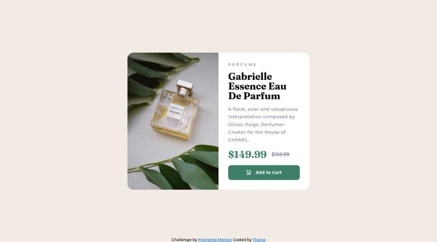
Design comparison
Solution retrospective
Please Provide your feedback!!! And tell me where I can improve my coding Skills... I usually struggle with my image's width and height property, if you guys can give me some suggestion, that would be a big help. Thank you
Community feedback
- @DrMESAZIMPosted over 1 year ago
Hi Tinker
Well done for the work you did on this challenge. I do have on suggesting your text is too close to the image . try to push the text away away from image by making use of padding and left properties .
If you find my suggestions difficult to implement . You can join us for our weekly live streams where we assists other developers by providing helpful reviews and feedback with live Frontend mentor code edits and reviews on this link. Your solution will also be reviewed and edited by myself link here >> https://youtube.com/live/L6WTd7HRTMM?feature=share
Marked as helpful1@Tiyana19Posted over 1 year ago@DrMESAZIM Thank you so much I will definitely join your live stream.
0 - @PetrosdevriPosted over 1 year ago
Hey there, nice work and congrats for completing the project!
A few notes on your solution:
- Try removing the
padding
property on the.card-text
class as it's expanding the text of the class to the bottom. Instead impelement a flexbox withdisplay: flex
. - Image doesn't seem to have problems in my computer, but you can follow the solution mentioned by Dennis.
- You may want to eliminate some classes before the actual class your style is affecting (f.e. instead of
.main-class .card-component
you can just write.card-component
). Otherwise you may want to use SASS as a preproccessor because nesting can be done at an easier pace and you could save a lot of lines.
In conclusion, your project seems to be decent and by working on various details and practicing frequently you will be able to achieve even better results.
Marked as helpful1@Tiyana19Posted over 1 year ago@Petrosdevri Thank you for your suggestions I will eliminate the class as per the uses... you told me to remove the
padding
from.card-text
, but I set it for the space around the text, is it the reason that my button is getting lots of space at its bottom? and if I remove it then what I can add for the space around the text... you said to adddisplay: flex
, but I don't understand its uses here. (if I usedjustify-content: space-between
orspace-around
orspace-evenly
then how will I control that extra space and mostly it won't give the space outside of the text like thepadding
will give.)1@PetrosdevriPosted over 1 year ago@Tiyana19 I think yes, just use DevTools and see how text is displayed with the padding and without it. Without any padding text remains inside the
.card-text
class (as it's the text where this styling is applied) even though kinda cluttered (texts don't have much space between each other). To fix this try using a flexbox (display: flex;
,flex-direction: column;
,justify-content: space-around
,align-items: start;
,gap: 20px
are some properties you can use and you may experiment on them). Especiallygap
is the most crucial one since it will define spaces between elements.Marked as helpful1@Tiyana19Posted over 1 year ago@Petrosdevri THANKS again for your guidance. I have update all these property that you mentioned, I don't know why but
column gap
seems not working their so I added thepadding
. tell me please if there is anything that I can do withcolumn gap
.0@PetrosdevriPosted over 1 year ago@Tiyana19 There is no exclusive property such as
column-gap
,flex-direction
refers to how the area is going to be aligned (horizontally or vertically) whilegap
returns the space between some elements. But your solution seems fine so that's great, also no problem for the guidance. 👌Marked as helpful1 - Try removing the
- @visualdennissPosted over 1 year ago
Hey there,
nice work! It looks like there is some little space below the image, because images are by default inline elements. You can change that with display: block; and get rid of that space. In fact, it is a common practice to have a css reset like so when starting to project:
img { max-width: 100%; display: block}
Hope you find this feedback helpful!
Marked as helpful1@Tiyana19Posted over 1 year ago@visualdenniss Thank you so much I was also wondering where this space actually comes from... can you please tell me what should I do with the space that is below that button I can't seems to find the solution...
0@visualdennissPosted over 1 year ago@Tiyana19 Happy to help!
I'd say in fact, you should avoid giving fixed heights altogether as it can cause various problems.
- Remove those stuff: height: calc(100% - 30%); width: calc(100% - 60%); top: 15%; left: 30%;
Try to set some max-width for the image instead. It will have a natural height. Control its height with max-width. As for the right section, you just need to adjust the paddings and margins and font-sizes accordingly to match the height. Just avoid fixed heights for it as well, the height should be determined by the content of the container. You can also give a max-width to the right section or the whole container.
Also some border-radius seems to be missing.
Marked as helpful1@Tiyana19Posted over 1 year ago@visualdenniss If I set the
max-width
of.card-component
to100%
, and then setmax-width: 50%
to bothimages
and.card-text
, then it won't be a problem. Right?0@visualdennissPosted over 1 year ago@Tiyana19 if you have 100% for the .card-component, it will take its parents full width, which is the entire screen in this case. Instead you can try something like max-width: 600px (in rem/em) for the .card-component. Then have images and .card-text max-width: 50% or width: 50%
and don't forget to remove these: width: calc(100% - 40%); height: calc(100% - 10%);
I've removed them and simply added max-width: 600px in dev tools and then max-width: 50% to the image and it looked pretty good to me, no need to even play with button paddings/margins.
Marked as helpful1@Tiyana19Posted over 1 year ago@visualdenniss THANK YOU SO MUCH I have removed
calc()
. you said I should add.card-component
to600px or 37.5rem
but if I addmax-width: 50%
instead of100%
to.card-component
so it won't have that issue, right? and also I wanna ask how you decided thatwidth
should be around600px
, let's say in this project we have a card and we can find it'swidth
by playing with dev tools. but it won't be go same with every other thing on website that we want to create, then how you decide that which width and height is perfect and there is also responsiveness their so it become crucial to find the rightwidth
andheight
. .and thanks again for your help
0@visualdennissPosted over 1 year ago@Tiyana19 Checked your new live version now, looking great!
I'd suggest not having width: 50% for .card-component mobile/tablet as it will cause it to shrink too much cuz 50% means half of the screen in this case and you don't need that. Just set min-width + max-width is enough in combination with width: 100% It'll make it responsive, but not go too big or too small.
Usually you have a design given, so u can measure it or simply estimate by your eye about how wide it should be (decision making of 600px) and you simply try to integrate a mobile, a tablet and a desktop version and try to set breakpoints only when necessary in-between.
Marked as helpful1 - @Tiyana19Posted over 1 year ago
@visualdenniss @Petrosdevri Thank to all who help me improve my solution, I have updated my solution please check and give feedback and any suggestion to improve.
2
Please log in to post a comment
Log in with GitHubJoin our Discord community
Join thousands of Frontend Mentor community members taking the challenges, sharing resources, helping each other, and chatting about all things front-end!
Join our Discord