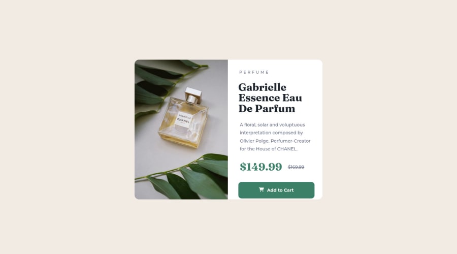
Design comparison
Solution retrospective
Update:
-
Having issues with Github updating the live site.
-
Cannot seem to keep the button in place when screen is larger than 1440px. Would anyone have a solution to that? Thanks!
<b>Resize</b> to 1440px and mobile version to view actual product.
Community feedback
- @iSoyecodesPosted about 2 years ago
Hello, congratulations on completing this challenge. Your coding is very clean, and I was able to understand it so that I could assist. To fix the issue you are having with the button not being in place on larger screens like desktops and laptops:
To center your card, first place it on your container, in this case the main tag; if you're using flex-box, don't include flex-grow and flex-shrink, just put;
main { display: flex; flex-flow: column nowrap; justify-content: center; }
Second, use "min-height: 100vh" instead of "height: 100vh" when centering your card. This will prevent the card from being constrained or appearing squashed because it cannot expand, which will force you to reduce padding and margin in order to fit the card's content, which won't look good. You used width: 100vw, which is a fixed width; instead, use width: 100% to make your card responsive rather than fixed. This will lead to an unresponsive experience on larger screens:
As the primary tag holds the entire card, place this there.
.main { width: 100%; min-height: 100vh; display: flex; flex-flow: colum nowrap; justify-content: center; padding: 4.13rem 1.5rem; /* example */ }
Then, since it contains the image and the card content, the main-card class is where you specify the card's maximum width :
.main-card{ width: 100%; max-width: 20.5rem ; height: auto; background-color: #fff; border-radius: 1.31rem; text-align: center; display: flex; flex-flow: column nowrap; gap: 1.81rem; }
Once more, set the width of the picture to 100% to make it responsive and to avoid having a fixed width. If the picture is too large or you want a specified height, you should only enter a fix-height value in the height field; otherwise, if you enter 100% for the width, the image will resize itself.
I apologize for the lengthy article, but depending on how you style your buttons, I think this will address the button issue. Avoid making it too large as this might lead to overlap. If you need any help fell free to ask.
Marked as helpful0@ab1820Posted about 2 years ago@iSoyecodes Hey thanks for the help! I will give that a try and see how it pans out! If it works I will let you know! Thanks so much :)
0
Please log in to post a comment
Log in with GitHubJoin our Discord community
Join thousands of Frontend Mentor community members taking the challenges, sharing resources, helping each other, and chatting about all things front-end!
Join our Discord