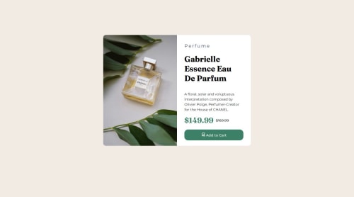
Submitted over 1 year agoA solution to the Product preview card component challenge
Product-Card-Perfum
@Mapp81

Solution retrospective
What are you most proud of, and what would you do differently next time?
I am proud of having reduced the time to complete the challenge. That means I consolidate knowledge. I will continue trying to improve in the next times.
What challenges did you encounter, and how did you overcome them?It takes a long time for @media to place a new image to be mobile responsive. I was trying code until I got it!
What specific areas of your project would you like help with?I would like to know if there is any trick to achieve responsive pages and not take a thousand years to achieve it.
Code
Loading...
Please log in to post a comment
Log in with GitHubCommunity feedback
No feedback yet. Be the first to give feedback on Ana's solution.
Join our Discord community
Join thousands of Frontend Mentor community members taking the challenges, sharing resources, helping each other, and chatting about all things front-end!
Join our Discord