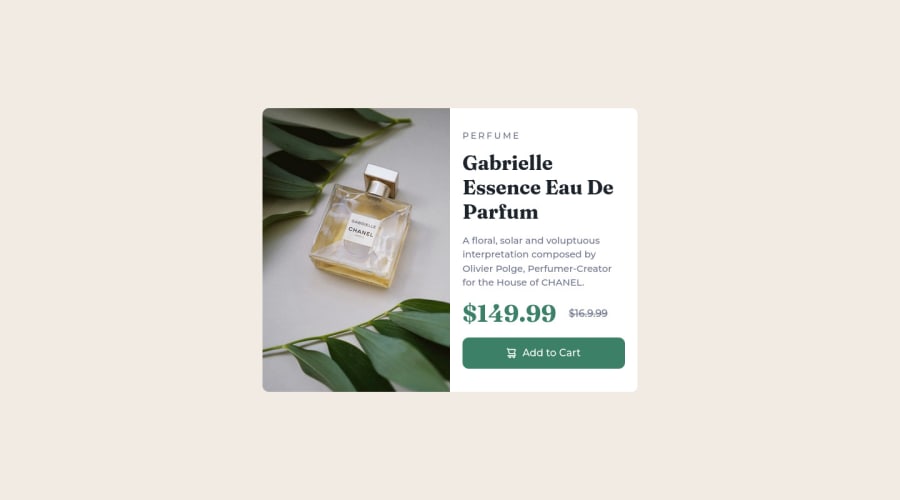
Product card made with flexbox, and design firts mobile (CSS+BEM)
Design comparison
Solution retrospective
It is difficult to center the containers globally, I applied the suggestion I was given to give the html and body a height of 100% and then center everything with flex-box, I do not know if that is efficient for larger designs.
Community feedback
- @CriztiandevPosted over 1 year ago
Hey 👋, the report notice that you havent put alt element to your image tag, I encourge you to always keep alt tag to the image for several reasons, first what is alt?
"alt", also known as alternative text or alt descriptions, is an HTML attribute that is used to describe the contents of an image in a web page. Including alt text in an <img> tag is important for several reasons:
-
Accessibility: Alt text provides a text description of an image for users who are visually impaired or use screen readers. This helps ensure that everyone has access to the information on your website, regardless of their ability to see the images.
-
SEO: Search engines cannot see images, but they can read the alt text. Including descriptive alt text can improve the visibility of your website in search engine results and make it easier for users to find your content.
-
Usability: If an image fails to load for any reason, the alt text will be displayed in its place. This helps ensure that users can still understand the context and content of the image, even if it is not displayed.
-
Improved User Experience: Alt text also helps to provide context for images and improve the overall user experience on your website. By describing the contents of an image, you can give users a better understanding of what the image represents and why it is important.
In summary, including alt text in your <img> tags is an important best practice for web development. It helps to make your website more accessible, improve search engine visibility, ensure that your content is still accessible if images fail to load, and improve the overall user experience.
Marked as helpful0@YanlDevPosted over 1 year ago@Criztiandev thank you, I will always take into account the accessibility of the resources I use for my future web projects.
0 -
- @Mr-jawPosted over 1 year ago
Hello 👋
Here are some tips that you can use to improve accessibility and better practice
HTML 📄
-
replace
<p>
with<h1>
in<p class="card__paragraph subtitle">PERFUME</p>
since it is the main heading of the component. And we don't usually use<p>
to display short texts. In this case, since it is the important text preferably using<h1>
is better -
and replace
<h1>
with<h2>
in<h1 class="card__title">Gabrielle Essence Eau De Parfum</h1>
since we gave the<h1>
for the PERFUME text we can give this a second-level heading which is<h2>
-
as i mentioned above avoid using
<p>
to display short texts (i.e<p class="card__best">$149.99</p>
and<p class="card__worse">$16.9.99</p>
). In this case, you can use something like<em>
,<strong>
, or<small>
. It will improve accessibility as well.
CSS 🎨
- It will always be a good practice to use relative units like
em
orrem
for margin, padding, width, and height for more responsiveness. avoid usingpx
which is an absolute unit.
Other than that your implementation looks good 👍
Great job on completing the challenge. HAPPY CODING 🔥
0 -
Please log in to post a comment
Log in with GitHubJoin our Discord community
Join thousands of Frontend Mentor community members taking the challenges, sharing resources, helping each other, and chatting about all things front-end!
Join our Discord