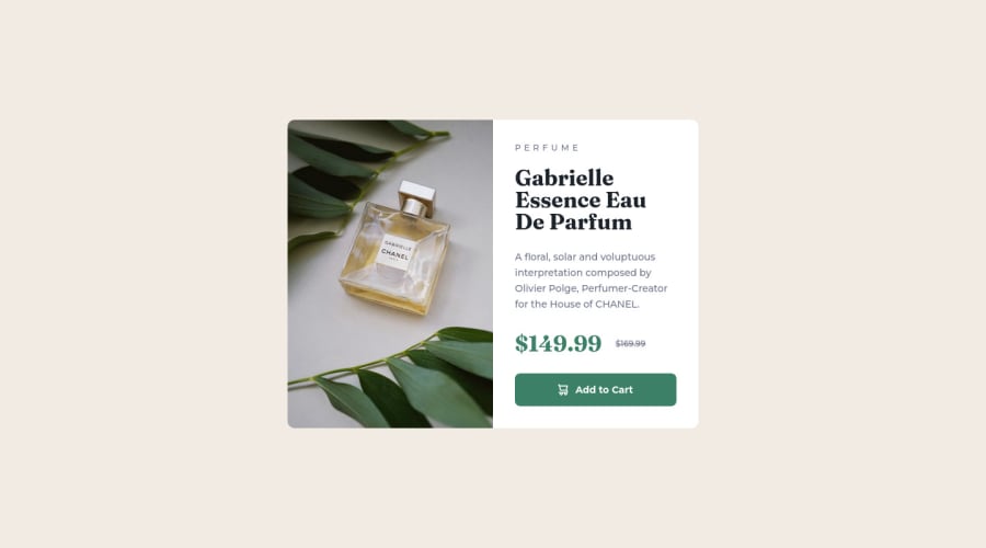
Design comparison
Solution retrospective
Hello there :)
I used <picture> and <source> tags to display the intended images on desktop and mobile, is this generally the best way to handle this?
Also about the image, I used object-fit: cover so it would always keep the same height as its parent. This way if the content on the right side is longer and makes the box grow, there won't be empty space below the image. It causes the image to zoom and crop though, so I wonder if it's a good thing to do.
Finally I'm not really sure about the best way to handle icons. I used an <img> tag calling the svg. I often see the <i> tag being used to contain icons even though it's not its original purpose.
Thank you for reading, happy coding!
Please log in to post a comment
Log in with GitHubCommunity feedback
No feedback yet. Be the first to give feedback on Pipow's solution.
Join our Discord community
Join thousands of Frontend Mentor community members taking the challenges, sharing resources, helping each other, and chatting about all things front-end!
Join our Discord
