Design comparison
Community feedback
- @VCaramesPosted about 2 years ago
Hey @Michal-Majchrzak, some suggestions to improve you code:
-
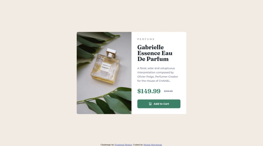
The Alt Tag Description for the image needs to be improved upon. You want to describe what the image is; they need to be readable. Assume you’re describing the image to someone.
-
There is only one heading in this challenge and that is the name of the perfume, “Gabrielle Essence Eau De Parfum”.
-
The old price 🏷 is not being announced properly to screen readers. You want to wrap it in a Del Element and include a sr-only text explaining that this is the old price.
Happy Coding! 👻🎃
Marked as helpful0@Michal-MajchrzakPosted about 2 years agoHey @vcarames, Thank you for your feedback, i've updated my code with your suggestions 😀️
0 -
Please log in to post a comment
Log in with GitHubJoin our Discord community
Join thousands of Frontend Mentor community members taking the challenges, sharing resources, helping each other, and chatting about all things front-end!
Join our Discord
