

Design comparison

Solution retrospective
Hello, another simple one from me.
I struggled with the image sizing in the different viewports. Can someone please educate me about best practices how to size the images?
Thanks a lot!
Community feedback
- @correlucasPosted about 2 years ago
👾Hello @Flexowitsch, Congratulations on completing this challenge!
Your solution its almost done and I’ve some tips to help you to improve it:
1.To improve your component overall responsiveness, something you can do its to create a media query to save space in the
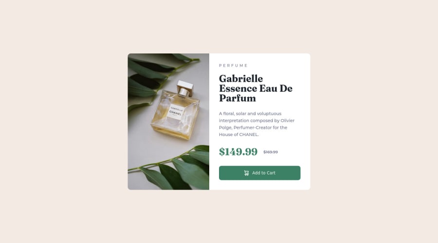
pricing sectionto make each information in a different row. Here’s the code for this media query.@media (max-width: 350px) { .price-container { display: flex; gap: 1.1875rem; margin-bottom: 1.875rem; align-items: center; flex-direction: column; } }2.A better way to work this solution image, the product image is by using
<picture>to wrap it on the html instead of using it as<img>orbackground-image(with the css). Using<picture>you wrap both images (desktop and mobile) and have more control over it, since you can set in the html when the images changes setting the screen size for each image.ote that for SEO / search engine reasons isn’t a better practice import this product image with CSS since this will make it harder to the image.Here’s the documentation and the guide to use this tag:
https://www.w3schools.com/tags/tag_picture.aspSee the example below:
<picture>
  <source media="(max-width:650px)" srcset="./images/image-product-mobile.jpg">
  <img src="./images/image-product-desktop.jpg" alt="Gabrielle Parfum" style="width:auto;">
</picture>
3.Use a CSS reset to avoid all the problems you can have with the default CSS setup, removing all margins, and making the images easier to work, see the article below where you can copy and paste this CSS code cheatsheet: https://piccalil.li/blog/a-modern-css-reset/
✌️ I hope this helps you and happy coding!
Marked as helpful0

Please log in to post a comment
Log in with GitHub
Join our Discord community
Join thousands of Frontend Mentor community members taking the challenges, sharing resources, helping each other, and chatting about all things front-end!
Join our Discord