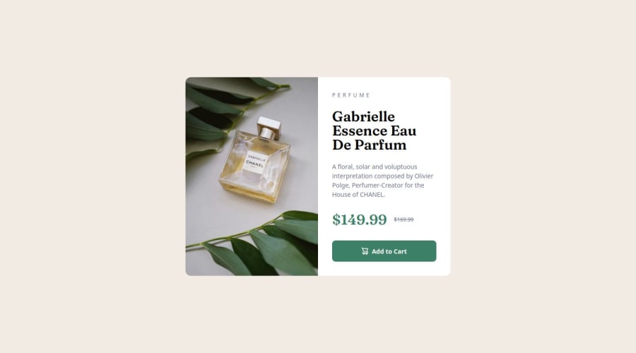
Design comparison
Solution retrospective
🛸Hello FEM Community! I'm Facundo and this is my solution for this challenge! 😊
🛠️ Built with:
- HTML 🧱
- Advanced CSS (Pseudo classes/elements & combinators)🎨
- Variable Fonts 🔠
- Flexbox ⚒️
- Grid ⚒️
- Responsive Design
- SEO 🌍
- Mobile First 📱
- NEW media query ranges syntax
- Conventional commits (git) 📜
Again, thanks to the Front-End Mentor team that creates challenges that make us learn a lot from doing them. 💟
If you have any suggestions on how I can improve this project, feel free to leave me a comment!
Feedback welcome 😊
What challenges did you encounter, and how did you overcome them?In this challenge I had a major problem when changing the preview image of the product depending on the screen size. After looking for solutions for a long time trying to use different image tags and neglecting different attributes, I decided to use two tags and using CSS I was able to solve the problem using the display property.
Please log in to post a comment
Log in with GitHubCommunity feedback
- P@shakthivel-rn
Nice work! You have perfectly used CSS variables and Relative Units to design the styling. But I noticed that the card did not change to mobile layout when I resized the window.
Join our Discord community
Join thousands of Frontend Mentor community members taking the challenges, sharing resources, helping each other, and chatting about all things front-end!
Join our Discord
