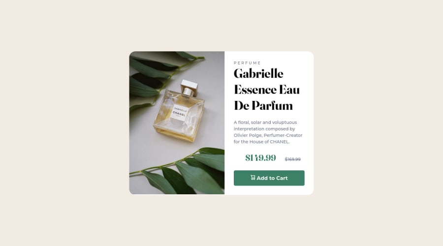
Design comparison
Solution retrospective
Will probably try to make another version, this isn't perfect
Community feedback
- @hyrongennikePosted over 2 years ago
Hi @veronisab,
Congrats on completing the challenge, there is always room to improve you did a good job just a few small thing to iron out. On the body instead of a
height: 100vhchange it tomin-height: 100vhto prevent content from overflowing.Set the background image size to cover to fill the container this will remove the white space underneath the image.
On mobile change the height of the image container from 400px to 200px and add margin on all sides of maybe 2rem. Scale down the heading to 2rem on mobile to reduce the height of the card.
Hope these help, let me know if you have any other questions.
Marked as helpful0
Please log in to post a comment
Log in with GitHubJoin our Discord community
Join thousands of Frontend Mentor community members taking the challenges, sharing resources, helping each other, and chatting about all things front-end!
Join our Discord
