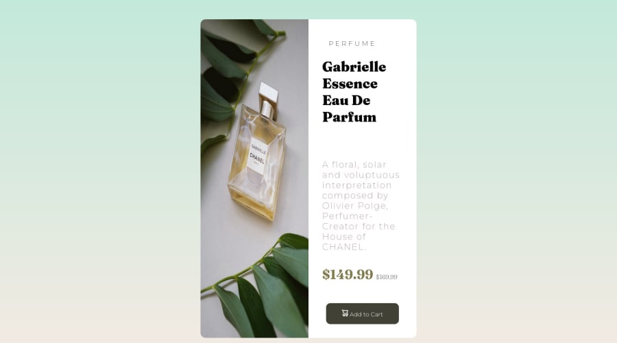
Design comparison
Community feedback
- @dxiDavidPosted almost 2 years ago
Hello @adarsaparasar
I have a few suggestions on how to improve the solution
-
First contain everything inside the
<main> </main>tags to improve accessibility. After that, put your container div then wrap the main elements, which are the picture and text, in divs of their own then use flexbox to position them. -
The markup you've written just has one container and that makes things unnecessarily difficult to control. Take the time to really think about the structure of your content which will make styling it easy.
-
Avoid using absolute values like pixels for margins, padding, and font size and use relative values like
emandremwhich improves responsiveness and accessibility -
Use
max-widthandmax-heightinstead ofwidthandheightfor a more responsive design. Also, avoid redeclaring the same values in a media query or active state if nothing is changing, it just makes your code messy and hard to read. Only declare what is changing. -
Last but not least try as much as possible to stick to the colors in the design
I hope you find this helpful, happy coding 🥂
1 -
Please log in to post a comment
Log in with GitHubJoin our Discord community
Join thousands of Frontend Mentor community members taking the challenges, sharing resources, helping each other, and chatting about all things front-end!
Join our Discord
