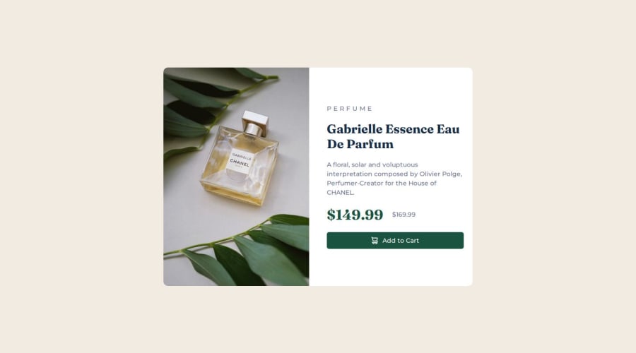
Design comparison
Solution retrospective
I used the "" tag. I usually put the image in a div and then change the size of this div like a cut mask, but I wanted to try something different.
What challenges did you encounter, and how did you overcome them?Working with the "" tag and trying to display the correct image for each resolution.
What specific areas of your project would you like help with?I'd like to receive more information about how I can properly use the "" tag (and the "" tag too) for each resolution.
Community feedback
- P@MikDra1Posted 9 months ago
This card solution is super good 👍
If you want some feedback next time I would suggest to take care of the with of the overall composition especially the text one 😄 If you want to change a small detail you can make a line throughout the old price text 😍👍👍
1
Please log in to post a comment
Log in with GitHubJoin our Discord community
Join thousands of Frontend Mentor community members taking the challenges, sharing resources, helping each other, and chatting about all things front-end!
Join our Discord
