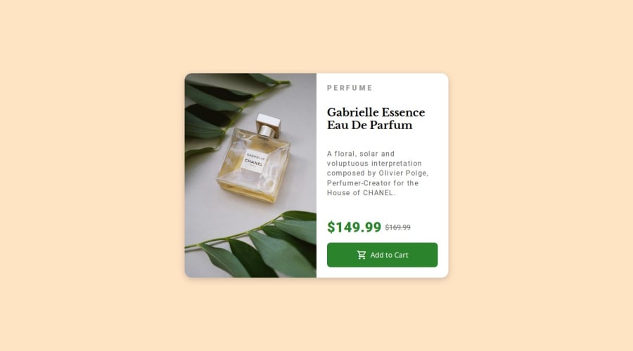
Design comparison
SolutionDesign
Community feedback
- @TarestaPosted 5 months ago
Hi there, that was some good work. I really liked how you used flexbox for the alignment of most of the elements in your design. This makes your page a whole lot responsive. Everything was great. Just something to take notice is that on smaller screens, the product-card does not have any top margin, so that might be something you can take a look into. Good job and all the best for your future projects.
Marked as helpful0
Please log in to post a comment
Log in with GitHubJoin our Discord community
Join thousands of Frontend Mentor community members taking the challenges, sharing resources, helping each other, and chatting about all things front-end!
Join our Discord
