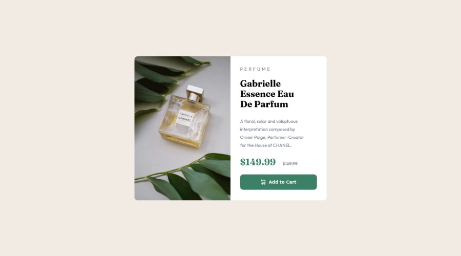
Design comparison
Community feedback
- @correlucasPosted about 2 years ago
👾Hello @mazinger086, Congratulations on completing this challenge!
You’ve done really good work here putting everything together, I’ve some suggestions to improve the design:
1.Add
min-height: 100vhto make sure your card will be ever centered:body { min-height: 100vh; display: flex; flex-direction: column; justify-content: center; align-items: center; background-color: hsl(30, 38%, 92%); margin: 0; font-family: 'Outfit', sans-serif; }2.You did a good work putting everything together in this challenge, something you can do to improve the image that needs to change between mobile and desktop is to use
<picture>instead of<img>wrapped in a div. Look that for SEO and search engine reasons isn’t a better practice import this product image with CSS since this will make harder to the image be found. You can manage both images inside the<picture>tag and use the html to code to set when the images should change setting the devicemax-widthdepending of the device (phone / computer) Here’s a guide about how to usepicture:https://www.w3schools.com/tags/tag_picture.asp✌️ I hope this helps you and happy coding!
Marked as helpful0
Please log in to post a comment
Log in with GitHubJoin our Discord community
Join thousands of Frontend Mentor community members taking the challenges, sharing resources, helping each other, and chatting about all things front-end!
Join our Discord
