
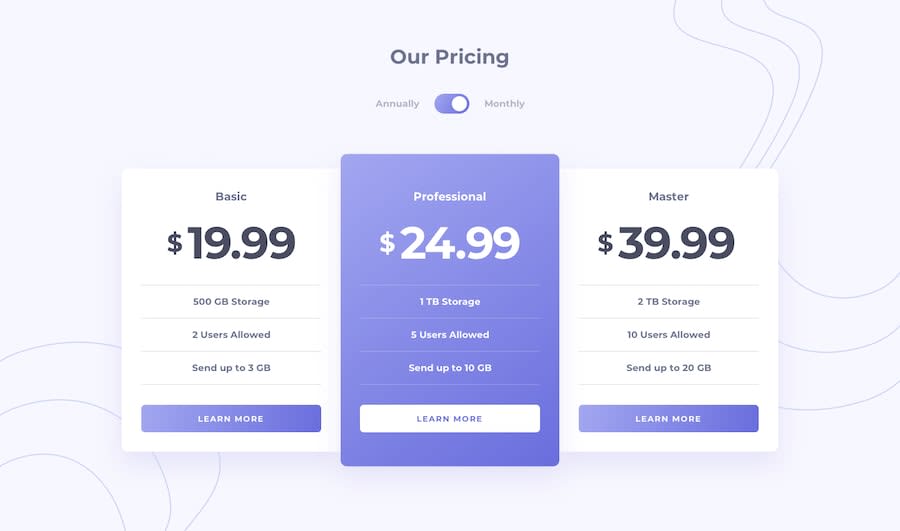
Princing Component with Toogle | NO Responsive

Design comparison
Solution retrospective
Learnt how to do the toggle thing. I've always wanted to do it, but never able to. Really cool project to enjoy.
Have several problems with the responsive, so at the end I decide it to not implement it. The main problem was when I used the @media screen... and I used: .flex-container{ flex-direction: row; }
I had a terrible overflow that I was not able to solve. I would really appreciate the help.
Community feedback
- @momorocks111Posted about 1 year ago
I personally used display grid for the cards. It made them easier to manage with the media queries.
Marked as helpful0 - @EmazsPosted about 1 year ago
Hola, claro utilizando las media queries, lo podías conseguir, yo hubiera modificado flex-container colocándolo de esta manera: .flex-container{flex-direction: column}
Además agregando un gap para crear un espacio entre las tarjetas asi: .flex-container{gap: 2rem}
también deberías modificar el height de main-container asi: .main-container {height: auto}, lo demás solo seria aplicar algún margin para separar el contenido. Espero que te pueda ser de ayuda 👋
0


Please log in to post a comment
Log in with GitHub
Join our Discord community
Join thousands of Frontend Mentor community members taking the challenges, sharing resources, helping each other, and chatting about all things front-end!
Join our Discord