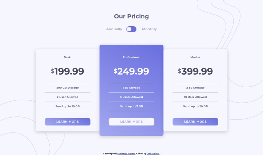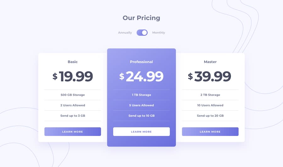
Design comparison
Solution retrospective
thanks for any feedback
Community feedback
- P@dwhensonPosted over 3 years ago
hey @dwi312 great work on this one - the component looks great 🙌 and responds well to smaller screens too 👍
Here's some points to have a think about:
-
As per the accessibility report, the heading following a
h1should only be ah2and so on down. It's not good practice to miss levels as it makes if harder for people using assistive tech to use your page. -
Similarly, and also in the report, every input must have a label. In this case the
checkboxinput is missing one. If you don't want the label to appear on the page you can apply a 'screen-reader-only' class to hide the content. If you google that you'll soon find lots of solutions and it's a good technique to be familiar with and it'll be useful in a lot of other challenges. -
I see you added
outline: noneto the checkbox. If you do this then it is important to add back in your own custom outline styles as otherwise it can make it very hard for keyboard users to navigate the page. If you don'e like the default styles I have found the advice in this article very useful, and use it in pretty much all my projects: https://css-tricks.com/the-focus-visible-trick/ -
Lastly, regarding the use of a checkbox, this is what I did originally with this challenge but I think went back and changed it to a radio button as I think that is more semantic, as the choice is really one or the other. This combined with proper labels also announces the change to screen-reader users.
But a with many things accessibility-wise this last point is my personal preference, and others may disagree.
But great work 👍 and keep it up!
Cheers 👋
Dave
Marked as helpful0@dwi312Posted over 3 years ago@dwhenson thank you for taking your time all the input you give is very good and I get a lot of experience from you. thank you very much for your input
0 -
Please log in to post a comment
Log in with GitHubJoin our Discord community
Join thousands of Frontend Mentor community members taking the challenges, sharing resources, helping each other, and chatting about all things front-end!
Join our Discord
