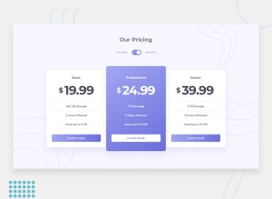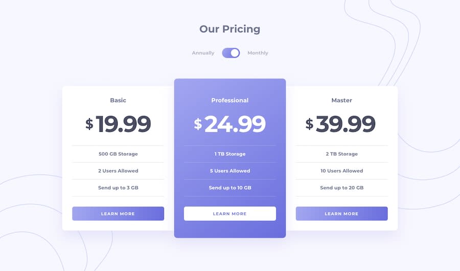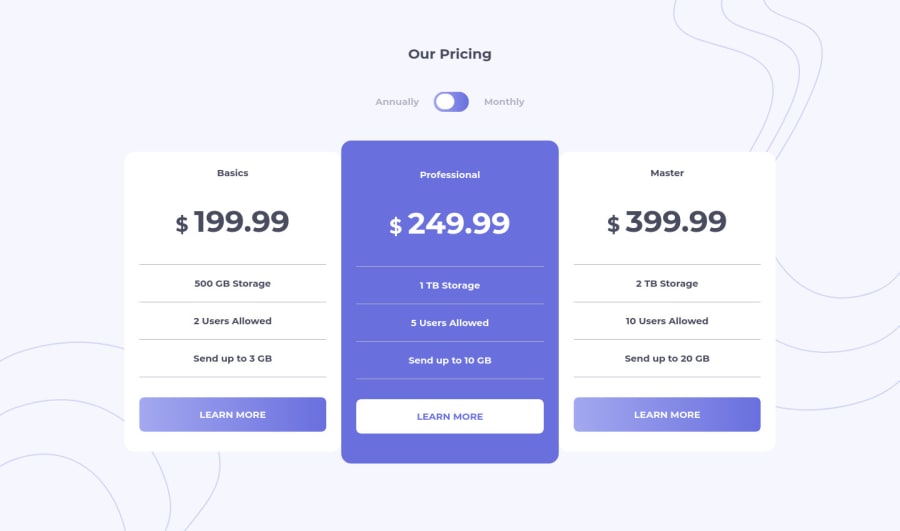
Design comparison
Solution retrospective
Hi guys, quite a fun challange, It would be appreciated if you answer some of the following question.
- This is my first time applying the mobile frist workflow, do you see any redundency ?
- How is the usage of BEM and have I used wrongly in any place ?
- Would you suggest a more modular approach twords scss even if the project is small ?
- Is the HTML semantic ?
- If you were to do this using only HTML and CSS how would write the conditionals ?
Happy coding :)
Community feedback
- @pikapikamartPosted over 3 years ago
Hey, great work on this one. Layout both desktop and mobile is good.
Regarding your queries:
-
Well I haven't really used mobile first, but I hope there is someone to see this and can help you with that:>
-
As we are BEM lovers, using BEM is to create reusable and extensible components right. In your case, you declare overly specified selector. For example
pricing
, just by the name and usage, we cannot really reuse that in other sections because it is made to be specific, as a block. In BEM, we create a block, B, which will be the somewhat parent right, then create elements, E, denoted by__
. That element, is somewhat what we reuse and extend. Lastly the modifiers, M, denoted by_
which states what is the element, what is the state. -
- In your structure, there are points where it is not BEM, but there some which is. Like the
btn
and that is good because we know that there will be things to be reused in buttons. Thosecard
as well could be good, since as we can see. There are multiple cards. But for thetoggle
andpricing
, I think not. You can create different selectors on those, provided it is general, hence block, which is not limited to a single element.(Take note, I am not an expert in BEM, still studying, and grasping it) .
- In your structure, there are points where it is not BEM, but there some which is. Like the
-
Hmm, for me, not entirely, but if I were to, I will just create some .scss file that contains some mixins or extensions and variables, but not the component itself. I prefer doing this instead of creating diffent module for different parts of the website. Unless it is big enough that navigating in one file is hard.
-
For the markup, some yes and some are not. For example those toggles. As you can see, you can select only one right, so radio buttons is really ideal on that. Having two radio buttons with the same name. By doing so, you created some accessibility feature. But as I can see, you are using checkbox, which is my first approach on this but later refactored it.
4.1. Your card headings, the basic is a heading right, which is good and it will be better if you made the prices headings as well. So when a screen reader reads it, it will read the heading "basics" followed by the price which is really great for them. You can use screen reader in your mobile phone and test the solutions that you made.
- If I were to use only css and html on this, I will create two html elements for the pricing. Example on the basics, I will create two html element for the pricing. One for monthly and one for annual.
5.1. But how can we target that right? What I will do is that, I will put my radio buttons at a higher level or at the same level of the container of the cards. This way, if I can toggle my radio buttons usings labels as a toggle UI. I can just make use of
.sample-radio-buttons:checked ~ .card .pricing-annual {display: block} .sample-radio-buttons:checked ~ .card .pricing-monthly{display: none}
Something like that.
If you need some guide on how to create it using two radio buttons here is my solution on this one. It is inspired a lot of Grace Snow's solution on this one. Check it, it is really great and awesome!!
Overall, great job ^
2@MojtabaMosaviPosted over 3 years ago@pikamart I deeply appreciate your thoughtful and thorough comment, you're turely a great commentator, receiving great comments helps me a lot to bacome a better developer. I am also a self-tought programmer who started with python and is now more focused on learning front-end. I looking for good resources on css and html, would really appreciate it if you could point to resouces (books,courses,toturials) that you've used in you journey as self-tought developer.
0@MojtabaMosaviPosted over 3 years ago@pikamart I deeply appreciate your thoughtful and thorough comment, you're turely a great commentator, receiving great comments helps me a lot to bacome a better developer. I am also a self-tought programmer who started with python and is now more focused on learning front-end. I looking for good resources on css and html, would really appreciate it if you could point to resouces (books,courses,toturials) that you've used in you journey as self-tought developer.
0@pikapikamartPosted over 3 years ago@MojtabaMosavi So we're just almost the same based on that path right.
Well, what I used before in frontend, is none other than freecodecamp. I used before when I was starting and it is really awesome. I think you already heard or know about this. But this is just basically my starting point.
Right now, been months and I am not using any resources anymore. I kind of grasped how some things in frontend works and it is all about putting x^2 amount of time, based on studying and applying.
Good luck to the both of ours right^^
1@MojtabaMosaviPosted over 3 years ago@pikamart I've done the html and css part of freecodecamp, it sounds simple but there is so much truth in it, thanks. Happy coding
0 -
Please log in to post a comment
Log in with GitHubJoin our Discord community
Join thousands of Frontend Mentor community members taking the challenges, sharing resources, helping each other, and chatting about all things front-end!
Join our Discord