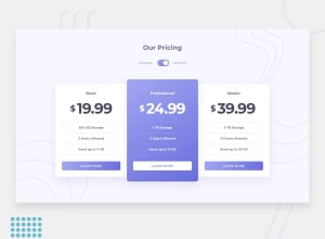
Design comparison
Solution retrospective
I have a non-ending problem with positioning background images, I struggled to place these patterns behind the cards. What do you use to position the images:
- multiple media queries
- percentages
- pixels ...
Implementing feedback from the comments below 👇
- Added accessibility on input focus
- Better background images positioning
** What I have learnt**
- You can use box-shadow to add a border around an element, esp when using focus-within
- Prefer
backgroundwhen adding background patterns. - You can add & position multiple images using
backgroundon the same element. - Normally patterns are for decoration purposes. If you choose to use
imgtags, avoid settingalt, they may cause confusion to screen-readers.
    background-image: url(img_url), url(img_url);
    background-position: left bottom, right top;
    background-repeat: no-repeat, no-repeat;
    background-size: n, n;
Thanks for the feedback and likes.
Happy coding 😊
Community feedback
- @AgataLiberskaPosted over 3 years ago
Hi @jmnyarega, I haven't done this challenge, but I would personally add the images in CSS as
background-imageto the body and in this case, just use keywords:background-position: top rightetc. I would also make sure that the body's min-height is set to 100vh - on my screen, the bottom image just doesn't reach the edges at all. I don't know if it's just my browser, but at the moment the top image seems to cause overflow issues on mobile screen sizes and it makes the cards really small - that approach would totally get rid of this issue :)Overall though I think you've done a really great job on this challenge! The only issue is the lack of focus styles on the toggle - but you could easily fix that by adding styling to the labels when the focus is on radio input. Ideally, you'd want some focus styles on the toggle itself, too...
.cycle-switch:focus-within .radioI think could work to select the toggle when there's focus on either of the inputs. I haven't tried it out though! :)Hope this helps!
Marked as helpful1 - @jmnyaregaPosted over 3 years ago
Hi @AgataLiberska, thanks for the detailed and insightful explanation. I will give
background-imagea try.- Accessibility slipped my mind on the toggle component, thanks for pointing that out too.
0
Please log in to post a comment
Log in with GitHubJoin our Discord community
Join thousands of Frontend Mentor community members taking the challenges, sharing resources, helping each other, and chatting about all things front-end!
Join our Discord
