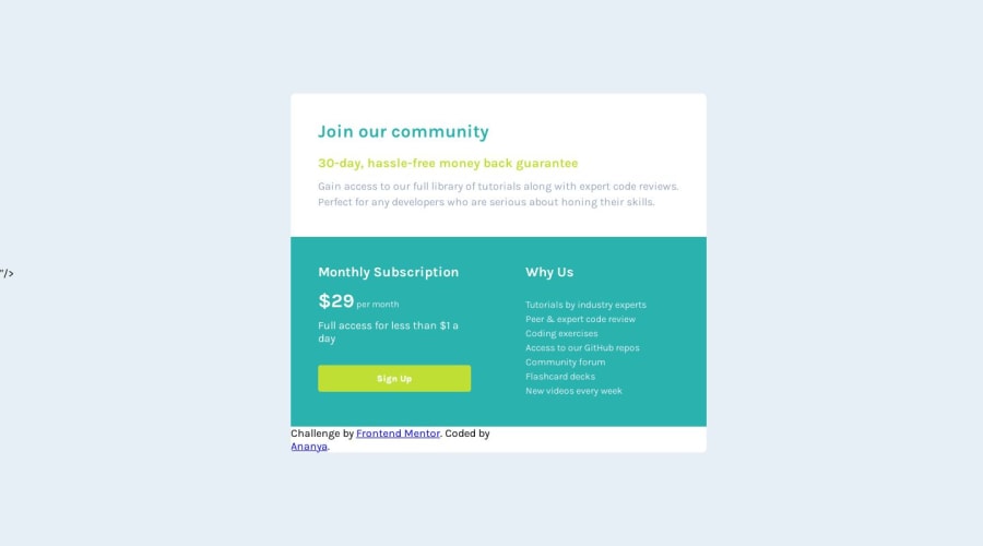
Pricing landing page using CSS grids
Design comparison
Solution retrospective
Hey Learners!
Here is my attempt to replicate the provided design using CSS grids. Feel free to point out my mistakes and ways to correct them!
Community feedback
- @YinkajayPosted about 1 year ago
The Google font import tag contains a visible
"/>", which should be addressed to ensure proper functionality without displaying text on the page.The background colors of the "Monthly Subscription" and "Why Us" sections differ in the design, but both sections have the same background color in the implemented solution. Adjusting these colors according to the design specifications is necessary.
The attribution should be positioned separately from the main solution, possibly at the bottom of the page using absolute positioning.
Apart from these, your solution is spot on and your responsivness is cool!
Marked as helpful0@Ananyab3100Posted about 1 year ago@Yinkajay Thanks for spotting out my mistakes. I will surely correct them!
0
Please log in to post a comment
Log in with GitHubJoin our Discord community
Join thousands of Frontend Mentor community members taking the challenges, sharing resources, helping each other, and chatting about all things front-end!
Join our Discord
