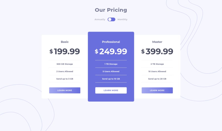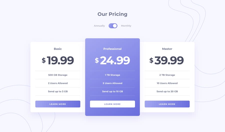
Design comparison
Solution retrospective
Feedbacks are wolcome!
Community feedback
- @vanzasetiaPosted over 1 year ago
Hi, Nino Khurtsidze! 👋
I recommend creating the toggle button with two radio inputs. Also, make sure each radio input gets labeled. This way, the users can toggle the price by clicking the labels—annually and monthly.
You can see the Pen of Scott O'Hara (an accessibility expert) as an example: Radio Toggle Switch
For the line, I recommend using
borderproperties. This way, you can make the HTML simpler by removing all<div class="line"></div>.I suggest making the type of the pricing heading elements, specifically
<h2>to give the page some structure.I hope this helps. Happy coding! 😄
1
Please log in to post a comment
Log in with GitHubJoin our Discord community
Join thousands of Frontend Mentor community members taking the challenges, sharing resources, helping each other, and chatting about all things front-end!
Join our Discord
