

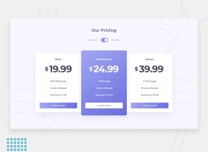
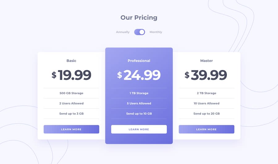
Design comparison
Solution retrospective
I would greatly appreciate any feedback 🚀
Community feedback
- @vanzasetiaPosted over 1 year ago
Hi, Robert Strzelczyk! 👋
I recommend creating the toggle button with two radio inputs. Also, make sure each radio input gets labeled. This way, the users can toggle the price by clicking the labels—annually and monthly.
You can see the Pen of Scott O'Hara (an accessibility expert) for your reference: Radio Toggle Switch
The prices should not be
<h3>elements. I recommend making them<p>elements instead.The card should not be
<figure>elements. Only use<figure>when you need to include a<figcaption>.I hope this helps. Happy coding! 😄
0 - @visualdennissPosted over 1 year ago
Great work! It is also quite responsive.
Looks like when you switch to mobile layout at 1000px with @media screen and (min-width: 1000px) all those individual cards simply stretch out the full screen, becoming too wide. This is fine for mobile or below 600px, but i'd suggest adding some bigger margin or padding to the sides of the cards for the tablet layout, or simply a max-width for the cards and center them horizontally.
Hope you find this feedback helpful!
0


Please log in to post a comment
Log in with GitHubJoin our Discord community
Join thousands of Frontend Mentor community members taking the challenges, sharing resources, helping each other, and chatting about all things front-end!
Join our Discord