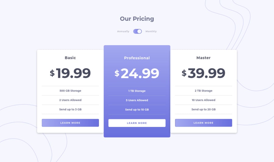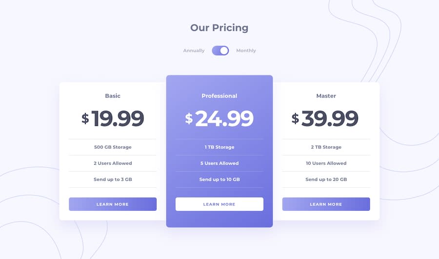
Design comparison
Solution retrospective
Feedback and suggestions are welcome :)
Community feedback
- @theschmockerPosted almost 3 years ago
Really great work on this! Solid, semantic HTML and the styles are really close to the design.
If I may, here are some suggestions for accessibility improvements.
One major concern is the toggler. Currently it is not keyboard or screen reader accessible. One possible solution to this would be turn it into a visually hidden checkbox with a label like "Show Annual Pricing" and some focus styles. That'll make it usable for keyboard users and will help screen reader users understand what it does. Here's a helpful article from CSS-Tricks with a code snippet for visually hidden styles that could be useful for a checkbox and its label: https://css-tricks.com/inclusively-hidden/
Some more minor tweaks to help make things easier to understand with a screen reader:
- Add a visually hidden h3 "Features" above the each of the features lists. That will help add context to what the lists represent
- Using VoiceOver, the prices currently read like "dollar" (move to next element) "nineteen point ninety nine". Something I've done in the past to help with this kind of stylized pricing element: apply aria-hidden to an element that wraps the dollar sign and the other pricing information. Outside of that element, add a visually hidden element that contains the price as it would normally be written, eg. "$19.99". I've found that VoiceOver will read it correctly as "nineteen dollars and ninety nine cents. You might be able to play with it a bit and simplify what I've suggested.
- Add some visually hidden text to the "Learn More" links. Something along the lines of
Screen-reader users sometimes navigate a page by its structure and/or the links and buttons it contains. With many links reading the same, it's hard to determine what "Learn More" is referring to. That little bit of extra context can make the page easier to navigate!<a href="#" class="learn-more">Learn More<span class="sr-only"> about the basic plan</span></a>
Hope this helps!
1@Aya-Saeed261Posted almost 3 years ago@theschmocker Thanks a lot for your help, I'm still trying to learn about accessibility so I really appreciate the information you offered.
1
Please log in to post a comment
Log in with GitHubJoin our Discord community
Join thousands of Frontend Mentor community members taking the challenges, sharing resources, helping each other, and chatting about all things front-end!
Join our Discord
