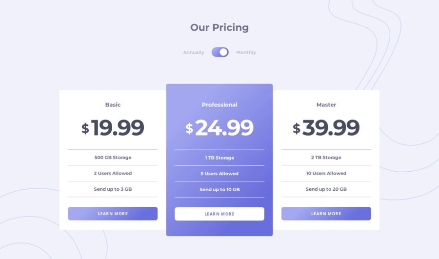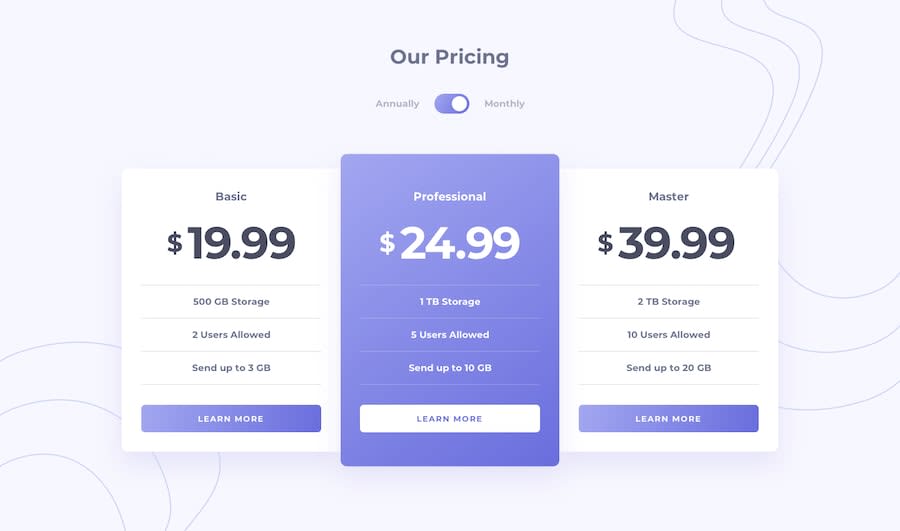
Design comparison
Solution retrospective
Hi here is my solution for Pricing-component-with-toggle. I used HTML, CSS, JS.
What specific areas of your project would you like help with?Feel free to leave any comments.
Thanks.
Community feedback
- @AutumnsCodePosted 10 months ago
I really enjoy this solution. Its include semantic HTML, layout looks good, is well-structured, readable and reusable.
My only suggestions is that the media-query need to have smaller breakingpoint. It just doesn't look right.
Bonus: I would be great if you had use some transition if you had build in some animation or transform when you switch from annual to monthly and vise versa.
Keep it up!
Marked as helpful1P@Lo-DeckPosted 10 months agoHi @AutumnsCode thanks for your support and comment that I can improve my code.
0
Please log in to post a comment
Log in with GitHubJoin our Discord community
Join thousands of Frontend Mentor community members taking the challenges, sharing resources, helping each other, and chatting about all things front-end!
Join our Discord
