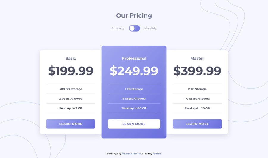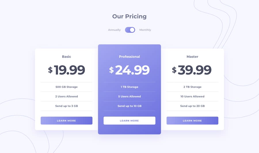
Design comparison
Solution retrospective
Feel free to leave any comments!
Community feedback
- @edburtnieks-privatePosted over 4 years ago
Looks really good and spot on!
Couple small things I noticed. For card buttons, I would use actually
buttonelement:) Wanted to tab around with keyboard and couldn't:( Also, I would add some:hoverand:focusstyles for toggle at the top for the same reason.One other thing, between screen width
861pxand1010pxthe cards are right against the side. Maybe put some padding around:)Otherwise, nice work:)
1@inkinkzPosted over 4 years ago@edburtnieks Thank you! I will try to update as you suggested :)
0 - @mattstuddertPosted over 4 years ago
Great work, Inkz! Edgar has already given some great feedback, so I won't add anything other than to also say keep up the great work! You're posting some awesome solutions 👍
0
Please log in to post a comment
Log in with GitHubJoin our Discord community
Join thousands of Frontend Mentor community members taking the challenges, sharing resources, helping each other, and chatting about all things front-end!
Join our Discord
