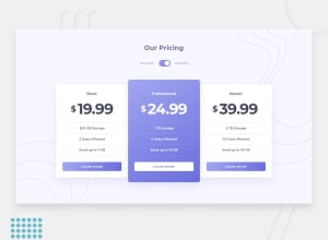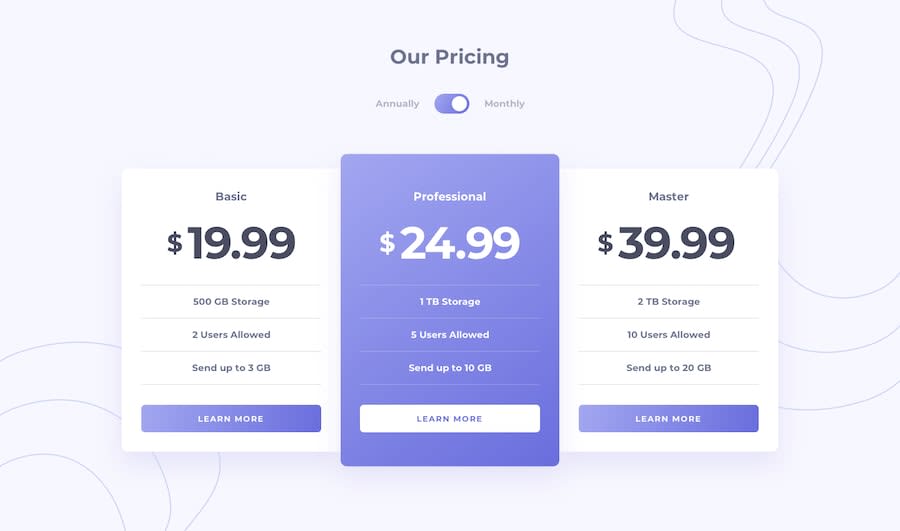
Design comparison
SolutionDesign
Solution retrospective
I appreciate any feedback or suggestions you have regarding the solution.
Community feedback
- @visualdennissPosted over 1 year ago
Great job in completing the challenge successfully! Your solution looks good overall, the design implementation is simple neat. Both mobile and desktop view respond well to resizing and toggle functionality works without any bugs.
One suggestion could be reducing the code repetition:
const cost1 = document.getElementById("cost-1")
const cost2 = document.getElementById("cost-2")
const cost3 = document.getElementById("cost-3")

const annuallyCosts = [199.99, 249.99, 399.99]
const monthlyCosts = [19.99, 24.99, 39.99]

toggleBtn.addEventListener("click", () => {
  toggleBtn.classList.toggle("after:left-1")
  toggleBtn.classList.toggle("after:left-7")

  if (toggleBtn.classList.contains("after:left-1")) {
    cost1.innerText = annuallyCosts[0]
    cost2.innerText = annuallyCosts[1]
    cost3.innerText = annuallyCosts[2]
  } else {
    cost1.innerText = monthlyCosts[0]
    cost2.innerText = monthlyCosts[1]
    cost3.innerText = monthlyCosts[2]
  }
})
there seems to be some repetitive code, you could perhaps use a function to make it more dynamic and scalable and pass these number or changing data as arguments to data make it more concise and reusable later.Hope this was helpful!
0
Please log in to post a comment
Log in with GitHubJoin our Discord community
Join thousands of Frontend Mentor community members taking the challenges, sharing resources, helping each other, and chatting about all things front-end!
Join our Discord
