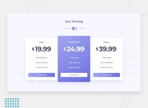
Design comparison
SolutionDesign
Solution retrospective
share your honest opinion on this project
Community feedback
- @catherineisonlinePosted almost 2 years ago
Looks great. I would also change the color of the buttons when you hover over it so it looks more interactive and cool 😎
0
Please log in to post a comment
Log in with GitHubJoin our Discord community
Join thousands of Frontend Mentor community members taking the challenges, sharing resources, helping each other, and chatting about all things front-end!
Join our Discord
