
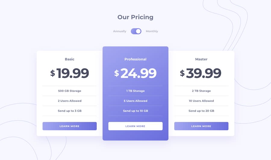
Pricing Component With Toggle using Flexbox & JavaScript | Responsive

Design comparison
Solution retrospective
Hey All!
This was a fun one to build, pretty straight forward 🎯
Flexbox to stack all 3 cards horizontally and vertically to make it responsive. JavaScript DOM to toggle classes in each card element that rolls between the Annual & Monthly Pricing, as well as the toggle button which transitions to either side on toggling & a bit of animation to put the cherry on the top ⭐
Thanks for checking out my work 😇
#js #dom #bem #flexbox #animation #responsive #toggle #no-frameworks
Community feedback
- @vanzasetiaPosted over 1 year ago
Hi! 👋
I have some suggestions to improve your solution.
- Use radio inputs for the toggle button. Remember to always use interactive elements for actionable elements. Using a
<div>element for the toggle button does not tell screen reader users that it is a button. Second, it does not tell the state of the button. - Replace all
<h4>with<h2>. Do not skip heading levels. In other words, heading levels must always be in order to give structure to a page. - Learn more about heading elements — How-to: Accessible heading structure - The A11Y Project
- Use anchor tags for the "Learn more" buttons. I think those buttons will navigate the users to another page.
- For your information, anchor tags are for navigation. The
<button>element is for an action like opening a modal, submitting a form, toggling an element, etc. It is essential to use the correct elements. - Use
remoreminstead ofpxfor font sizes. Never usepxunit. Relative units such asremandemcan adapt when the users change the browser's font size setting. Learn more — Why you should never use px to set font-size in CSS - Remove
width: 100%from the<body>styling. It is already the default styling. - For animations and transitions, take a no-motion-first approach. This way, the users who choose to see them will be able to see them. Also, if the users' browsers don't support the
prefers-reduced-motionmedia query, they will not see them and that's fine as long as the animations are not needed to understand the page content. Read more — prefers-reduced-motion: Taking a no-motion-first approach to animations » Tatiana Mac
I hope this helps. Happy coding! 😄
Marked as helpful0@frankuxurPosted over 1 year ago@vanzasetia
hey there!
thanks for taking the time and going through my work, and for the value feedback. it really means a lot to me. i will definitely consider these points while tacking my upcoming challenges, and read more into them 🫡
cheers mate! 😇
0 - Use radio inputs for the toggle button. Remember to always use interactive elements for actionable elements. Using a

Please log in to post a comment
Log in with GitHub
Join our Discord community
Join thousands of Frontend Mentor community members taking the challenges, sharing resources, helping each other, and chatting about all things front-end!
Join our Discord