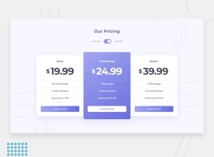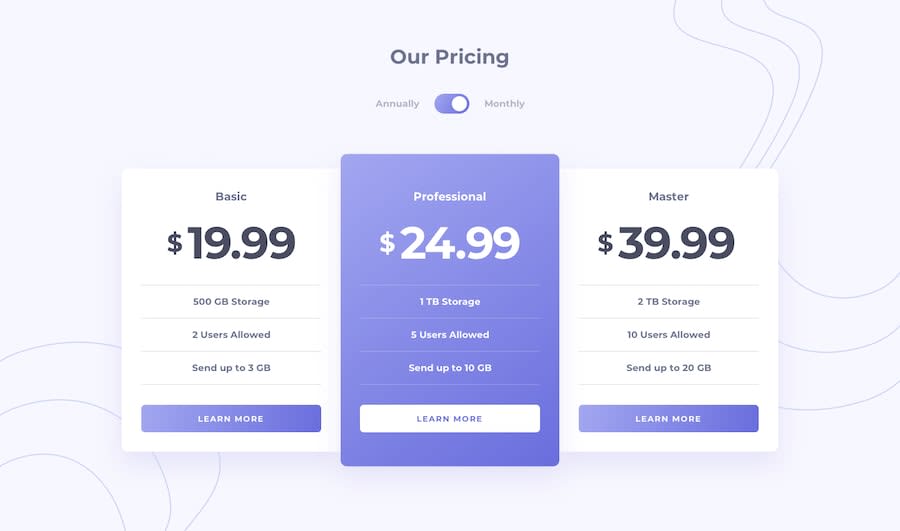
Design comparison
SolutionDesign
Solution retrospective
Hey there!
I just finished my first junior challenge, Let me know what you think in comments!
Community feedback
- @ApplePieGiraffePosted almost 4 years ago
Hey, Victoria Chacin! 👋
Congratulations upon completing your first junior challenge! 🎉
Your solution looks great and is responsive! 👍
I suggest,
- Giving a higher
z-indexto the heading of the page so that it doesn't get hidden behind the top left background image in the mobile layout of the site. - Using forward slashes rather than back slashes for the
srcattributes of the images on the page should clear up your solution report.
Keep coding (and happy coding, too)! 😁
0@vchacinPosted almost 4 years agoHi, @ApplePieGiraffe!
I hope that everything is fine, I'm going to apply the changes you suggested.
Thank you very much for the feedback! :)
0 - Giving a higher
Please log in to post a comment
Log in with GitHubJoin our Discord community
Join thousands of Frontend Mentor community members taking the challenges, sharing resources, helping each other, and chatting about all things front-end!
Join our Discord
