


Design comparison
Solution retrospective
Any feedback would be appreciated:)
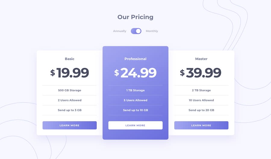
I would like to know: Q. How did everyone center the dollar sign? The pseudo class first-letter only works for block element, the property vertical-align only works for inline element. Therefore, I turn my span into inline-block so that both first-letter and vertical-align work.
Community feedback
- @xphstosPosted over 2 years ago
Hey there! Good job on this one! Regarding your question about the dollar sign.
If you have two
inlineelements with differentfont-sizeyou can have them aligned (vertically) if both of them have the sameline-heightand adjust thevertical-alignproperty of the shorter one. That's actually the "hard" or the "old" way if you prefer.. For example, we have this piece of html:<p> <span class="sign">$</span> <span class="value">199.99</span> </p>We could have them aligned with this:
span {
  line-height: 3rem;
}

span.sign {
  vertical-align: top;
}

span.value {
  font-size: 2rem;
}
Nowadays we have flexboxes to do that work for us. Again, for the same piece of code we could have the following css.
p {
  display: flex;
  align-items: center;
}

span.value {
  font-size: 2rem;
}
This time we set the parent as a flex container and we align vertically all the children. We could also have this by setting the parent element with a
position: relativeand then setposition: absoluteat the sign element. Now "just" need to vertically align it by giving ittop: 50%andtransform: translateY(-50%). The issue now is that the sign falls over the our value. We need to "know" the signs width and apply it aspaddingin parent element or asmarginin our inner element that's right after our sign element. As you can guess it's not the optimal way but an option nonetheless.To be honest your solution is a very creative and modern approach! The only drawback it works only for one character, other than that I love it!!!
As for me, I choose the "old" way just because.. no particular reason. You can see my solution here.
Marked as helpful1@hejkeikeiPosted over 2 years ago@xphstos Hi Chris, Thanks for your thorough explanation! I really like that you put the dollar sign in
::before. I trying to avoid separating the dollar sign and numbers because I'm not sure if the searching engine will treat them as a one thing or two elements. If it's totally fine to separate them I might use flexbox haha.0@xphstosPosted over 2 years ago@hejkeikei I think you're on to something there, regarding SEO. Probably you're right, I'm not so sure about myself if search engines treat differently elements with currency symbols. Although I do know for sure they look the page's schema in meta tags. Your solution was great and I'll try it in my next project.
0

Please log in to post a comment
Log in with GitHubJoin our Discord community
Join thousands of Frontend Mentor community members taking the challenges, sharing resources, helping each other, and chatting about all things front-end!
Join our Discord