Design comparison
SolutionDesign
Solution retrospective
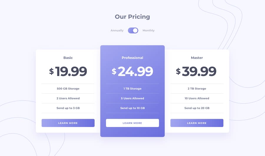
In this exercise, I used two radio buttons. I would love to hear what solutions you came up with for building out the toggle, and the pros and cons.
Pros
- The label can be clicked to change the selection
- No animations required to reflect the new state
- More radios can be added
Cons
- Difficult to style
- Difficult to animate the transition
Community feedback
Please log in to post a comment
Log in with GitHubJoin our Discord community
Join thousands of Frontend Mentor community members taking the challenges, sharing resources, helping each other, and chatting about all things front-end!
Join our Discord
