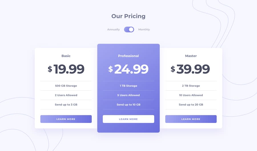
Design comparison
SolutionDesign
Solution retrospective
Feedback pls
Community feedback
- @festsnusaPosted almost 2 years ago
Hi there! Congratulations for completing this challenge.
Here's my feedback:
- to place your main component in the center, you can use grid: display: grid; min-height: 100vh; place-content: center;
- try to place your styling into the CSS/SCSS file, not inside HTML file;
- importing google fonts is not a good practice. to download fonts to your hub, you can use "google-webfonts-helper";
- you can try to use SCSS instead of pure CSS, because you'll be able to use mixins and include nestings;
- i guess, "Learn More" should have "cursor: pointer";
- in your JS file, instead of adding styles, you can toggle classes. and instead of using "else", you can use "return".
Hope you found my feedback useful. Happy coding.
Marked as helpful0@darlanbbsPosted almost 2 years ago@festsnusa Ty :)
I changed the style to a forEach with toggle but I didn't understand the return, and I don't know how to use scss yet.
but the toggle tip was really good
0
Please log in to post a comment
Log in with GitHubJoin our Discord community
Join thousands of Frontend Mentor community members taking the challenges, sharing resources, helping each other, and chatting about all things front-end!
Join our Discord
