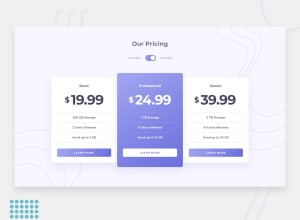
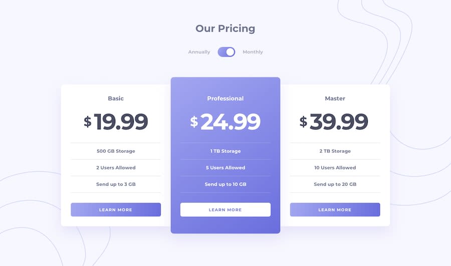
pricing component with toggle - mobile first workflow + scss
Design comparison
Solution retrospective
while I was making this I realized to need to learn more about aria labels because im not sure how accessible the button is. does anyone have any tips?
Community feedback
- @dwhensonPosted about 3 years ago
Hey @ConradMcGrifter lovely work here. The site looks great š. As you noted though, it is not really very accessible at the moment to people using assistive tech.
The main trick to learning about aria labels is to try your page with a screen reader. I like to think of this as just trying the page in another browser. It can be a bit tricky at first to get used to but once you know the basics it becomes easier.
This can help you identify where aria might be useful. For example in this case on the 'learn more' links, an aria label might be useful to say something like 'learn more basic plan' etc. If you are keen to explore this more there is an excellent free Udacity course on accessibility stuff that introduces using a screen reader, and a whole load of other stuff.
With regard the toggle switch, I would argue that this would actually be better as radio button with two options of annually and monthly, with associated labels. These should then get announced to assistive tech users on selection without the need for aria (remembering that the first rule of aria is don't use aria!). As with many things accessibility-wise other people might debate this.
This is a great but quite in-depth article on the subject in case you are interested to read more: https://www.sarasoueidan.com/blog/toggle-switch-design/
Cheers š
Dave
Marked as helpful0
Please log in to post a comment
Log in with GitHubJoin our Discord community
Join thousands of Frontend Mentor community members taking the challenges, sharing resources, helping each other, and chatting about all things front-end!
Join our Discord