

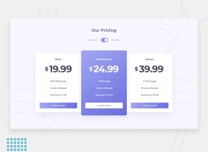
Design comparison
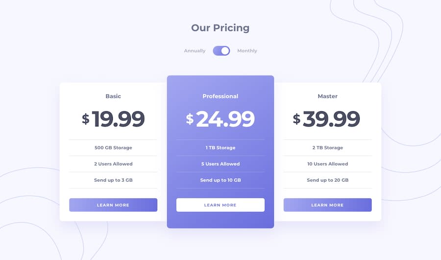
Solution retrospective
As this is my first junior challenge, feedbacks are always appreciated ! Created a responsive site with HTML, CSS and JS .
Thank you !
Community feedback
- @NiallJoeMaherPosted over 4 years ago
Criticism:
- The main font sizes are a little too small
- The circle in the switch is looking like it's pushed up too far. You could make the circle slightly smaller and it would probably fit a little better.
- The margin for the title is too big.
- The buttons are missing rounded corners.
Positives:
- This is close to perfect and looks fantastic!
- The gradients look so cool.
- You got everything aligned as it should be.
Great job overall, you should be proud!
2 - @nityagulatiPosted over 4 years ago
Sijan, the site looks great! Some pointers that can help simplify the code further.
-
button-details div -- Instead of using
position: relativeand multiple space characters in the html file, I would use Flex to space and align the elements. -
Cards -- Instead of adding
<p>and<div class="line">elements, you can simply use<ul>and then add borders to the<li>tags. -
As the HTML report suggests, unchecked = false isn't a valid attribute. When you want the checkbox to be checked, you can simply add the checked attribute to the input tag. And when that attribute is not present, it's false by default.
<input type="checkbox" id="test" name="test" checked><input type="checkbox" id="test" name="test">You can also look up HTML5 semantic tags and try it out in the next challenge. Love the slide effect to move the card down when the viewport is small.
Keep up the good work! :)
1 -


Please log in to post a comment
Log in with GitHubJoin our Discord community
Join thousands of Frontend Mentor community members taking the challenges, sharing resources, helping each other, and chatting about all things front-end!
Join our Discord