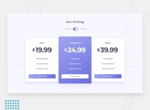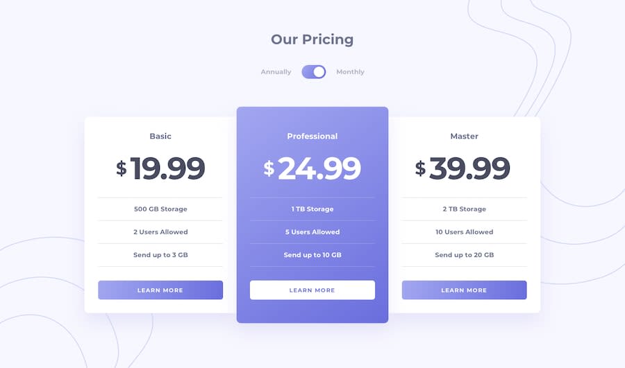
Design comparison
Solution retrospective
Hello, this is my project. I found this one to be a little too simple to be honest, I'm thinking about redoing it and adding animation and stuff. In any case, if anyone has any tips or remarks it would be appreciated
Community feedback
- @AlexKMarshallPosted about 3 years ago
It looks good, the html structure is solid, and the styling looks good.
The toggle button has good focus styling, but it doesn't work from the keyboard properly. A checkbox should respond to pressing spacebar, but you're only listening for
<enter>in the script file.Instead of adding two separate event listeners for
keydownandclick, you could listen forchangewhich will fire whenever the user checks or unchecks the toggle. This will then retain all the accessibility features of the native<input type='checkbox'/>Marked as helpful1@CoderPr0Posted about 3 years ago@AlexKMarshall I wasn't aware of that, thank you for the tips. :)
0
Please log in to post a comment
Log in with GitHubJoin our Discord community
Join thousands of Frontend Mentor community members taking the challenges, sharing resources, helping each other, and chatting about all things front-end!
Join our Discord
