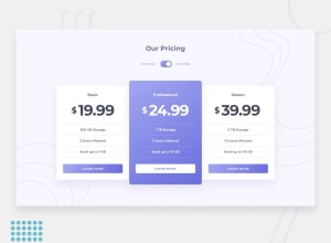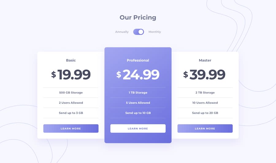
Design comparison
Community feedback
- @catherineisonlinePosted almost 2 years ago
Hello 🙌🏻 Your solution looks great however here are a couple of things you can improve which I hope will be helpful! 😎
It’s important to replace button tags with <a> tags because the purpose of <a> tag is redirection to another page. Buttons are useful when you want to create some interactivity on the same page, for example, a pop-up modal or form submission. Definitely, this is not a bug project and this button has no purpose right now however and it could potentially be a button as well but less likely, it’s good to have that habit of differentiating buttons and <a> tags😊
I would also add some transitions for active states (when colors change on hover). It creates more interactivity and makes the project look cooler. Active states can be done on buttons, links, titles which act like links, or anything else, you choose.
You can read more about it here, in case you haven’t done much of it: https://www.w3schools.com/css/css3_transitions.asp
I also see you don’t have README. README is a very important aspect of making projects, especially if you want other people to see it. As the name says, it’s the first thing people read when interacting with the project, it is kind of a manual. You can include many things there like the languages you used, which dependencies you installed, what was the process like, and what did you achieve or learn. Frontend Mentor also has a pretty nice README template which you can use to tailor the one depending on your preferences.
0
Please log in to post a comment
Log in with GitHubJoin our Discord community
Join thousands of Frontend Mentor community members taking the challenges, sharing resources, helping each other, and chatting about all things front-end!
Join our Discord
