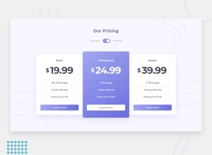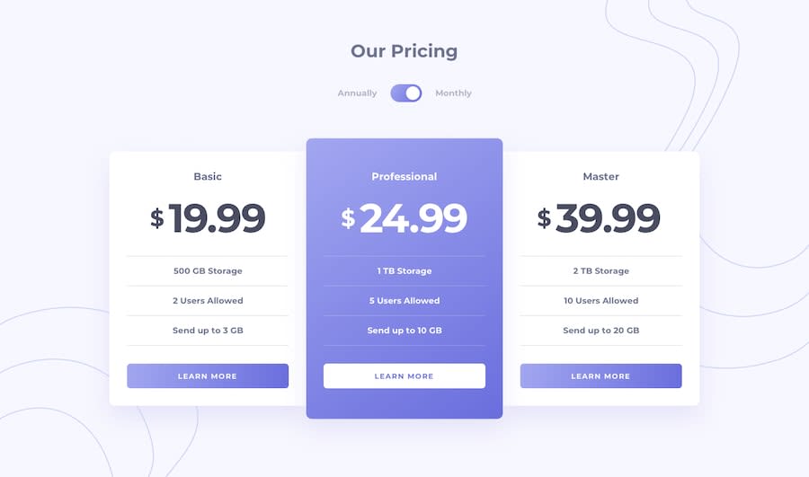
Design comparison
Solution retrospective
I have made a lot of mistakes in this project, point them out and help me to make this project according to the design.
Community feedback
- @mattstuddertPosted almost 5 years ago
Hey Saurav, what mistakes do you feel that you've made while building this project? Here are a few pointers after taking a look at your code:
- You're not loading in the
700weight that you need of Montserrat to display the content correctly. This is making your content appear thinner vs the design. - You're using multiple
h1elements on the page. I'd always recommend only using a singleh1, which is your main page heading. - You've got
h1,h3andh4elements, but noth2. Avoid skipping heading levels unnecessarily as it can lead to accessibility issues with the content hierarchy.
I hope these tips help. Keep up the great work!
0@sauravchamoli17Posted almost 5 years ago@mattstuddert I've fixed the multiple h1 present in the project but I am not able to fix the font weight of the content and the background pattern is also not visible. Can you help me out with this?
0@mattstuddertPosted almost 5 years ago@sauravchamoli17 to load in
font-weight: 700from Google Fonts you'll thislinktag instead of the one you've got:<link href="https://fonts.googleapis.com/css?family=Montserrat:700&display=swap" rel="stylesheet">. I'd recommend having a deeper look at Google Fonts to see how you can customise the fonts that you load in to add different weights.For the background patterns, you've just got the wrong path for the images. You need to change
url(/images/bg-top.svg), url(/images/bg-bottom.svg)tourl(../images/bg-top.svg), url(../images/bg-bottom.svg).0 - You're not loading in the
Please log in to post a comment
Log in with GitHubJoin our Discord community
Join thousands of Frontend Mentor community members taking the challenges, sharing resources, helping each other, and chatting about all things front-end!
Join our Discord
