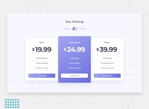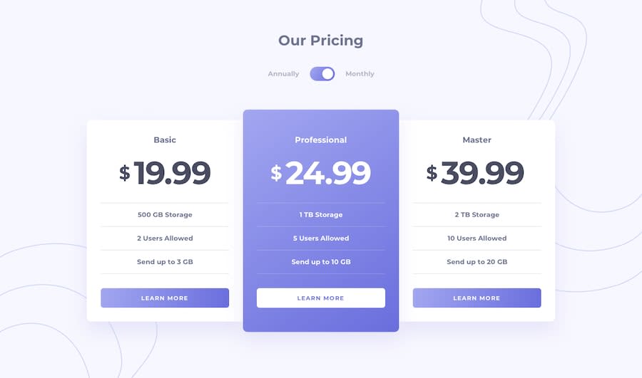
Design comparison
SolutionDesign
Community feedback
- @suleman1220Posted almost 5 years ago
Your solution is awesome just adjust the mobile media query and add in it the card master and card basic border radius on all sides also to give it a clean look but overall great work.
0@abidou08Posted almost 5 years ago@suleman1220 Thanks for suggestions, I updated mobile media query
1
Please log in to post a comment
Log in with GitHubJoin our Discord community
Join thousands of Frontend Mentor community members taking the challenges, sharing resources, helping each other, and chatting about all things front-end!
Join our Discord
