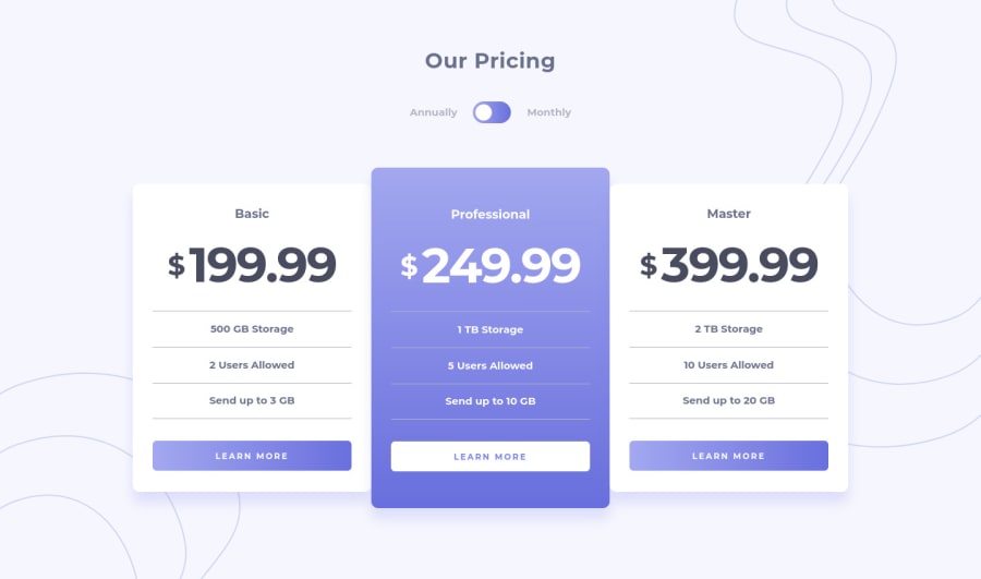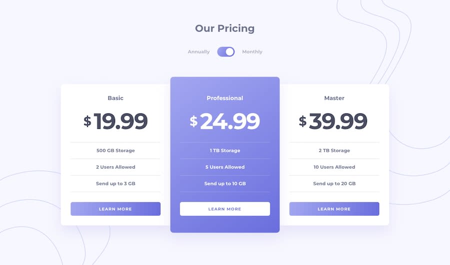
Design comparison
Solution retrospective
Is my toggle okay with regards to accessibility? I made 'Annually' and 'Monthly' the labels of radio button <input>s so that the user can click these or focus on them to change the toggle direction.
Community feedback
- @pikapikamartPosted about 3 years ago
Hey, awesome work on this one. Site in desktop looks great, it is responsive and the mobile state looks great as well.
Also your toggle works really well. Your usage of
inputis right and is accessible. Just to further make it accessible, wrap those radio button inside afieldsetalong with ansr-onlylegendelement that will describe what those radio buttons are for.Some a little suggestion on the site would be:
- Those items below each card pricings could be inside a
ulsince those are "list" of information about each of the 3 pricings.
The site looks great as well to be honest. Really nice work on this one^^
Marked as helpful0@BenConfigPosted about 3 years ago@pikamart Thanks Raymart, I have made the changes you suggested. I'm very happy with this one.
1 - Those items below each card pricings could be inside a
Please log in to post a comment
Log in with GitHubJoin our Discord community
Join thousands of Frontend Mentor community members taking the challenges, sharing resources, helping each other, and chatting about all things front-end!
Join our Discord
