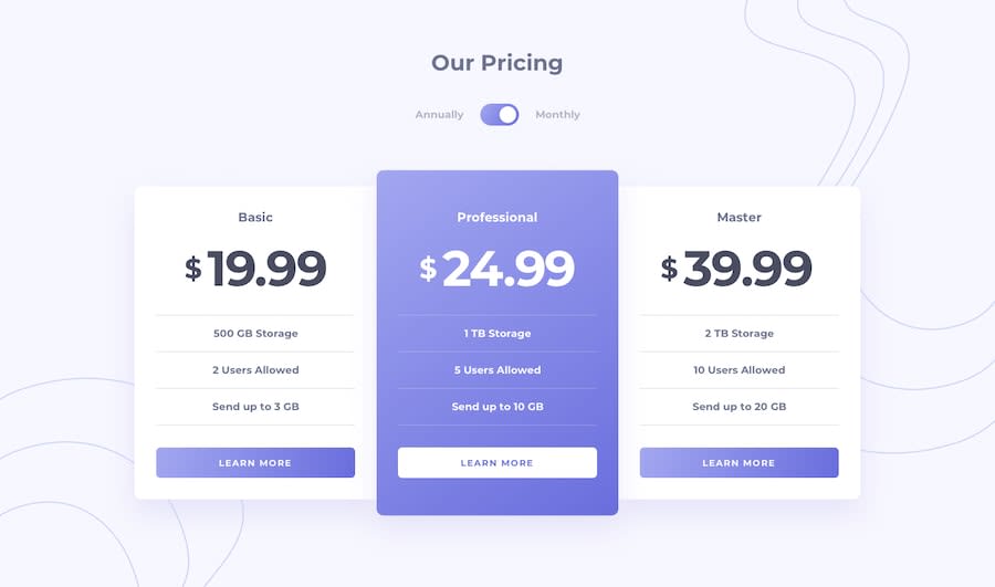
Design comparison
SolutionDesign
Solution retrospective
If there is any best practices that I missed out or anything that I can improve please let me know👍👍
Follow me and be a part of my journey on completing all free frontend mentor challenges (22/62)✌✌
All feedbacks are welcome
Community feedback
- @Orib-FarhanPosted about 1 year ago
While hovering on 'Learn more' the boxes get bigger. maybe because of the borders. If you change it, I think it will look more amazing.
0
Please log in to post a comment
Log in with GitHubJoin our Discord community
Join thousands of Frontend Mentor community members taking the challenges, sharing resources, helping each other, and chatting about all things front-end!
Join our Discord
