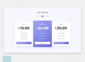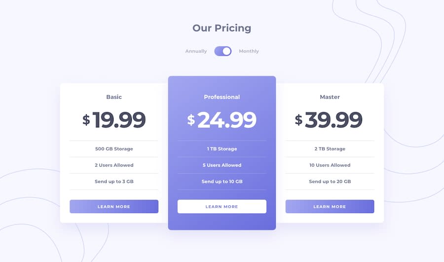
Design comparison
SolutionDesign
Solution retrospective
Any suggestions would be appreciated.
Community feedback
- @ApplePieGiraffePosted almost 4 years ago
Hey, Erik Tangvik! 👋
Nice work on this challenge! 👍 Your solution looks good and is responsive! 👏
I suggest,
- Allowing users to scroll in the desktop layout of the site (currently, vertical scrolling is disabled, meaning some of the content of the page is cut off and unreachable on smaller screens).
- Using CSS background images to add and position the background SVGs in this challenge, as it'll keep your markup cleaner and is often easier to position.
- Making the toggle-switch tabbable so that users can access and use the toggle-switch.
Keep coding (and happy coding, too)! 😁
And happy holidays! 🎄
1@Etang131Posted almost 4 years ago@ApplePieGiraffe I fixed the li lines that were out of place as well.
1@ApplePieGiraffePosted almost 4 years ago@Etang131
Just took another look—good work! 👍
1 - @abhik-bPosted almost 4 years ago
Hi Erik, Your solution is absolutely perfect 🔥
- it is very responsive
- toggle mode is working absolutely fine
- just a opinion you can use
background-imageinstead ofimgtags because thosesvgs are just for decorations
Great job on this challenge 👌👌, Keep it up 💯
1@Etang131Posted almost 4 years ago@abhik-b Thanks for the advice I cleaned it up a bit more.
0
Please log in to post a comment
Log in with GitHubJoin our Discord community
Join thousands of Frontend Mentor community members taking the challenges, sharing resources, helping each other, and chatting about all things front-end!
Join our Discord
