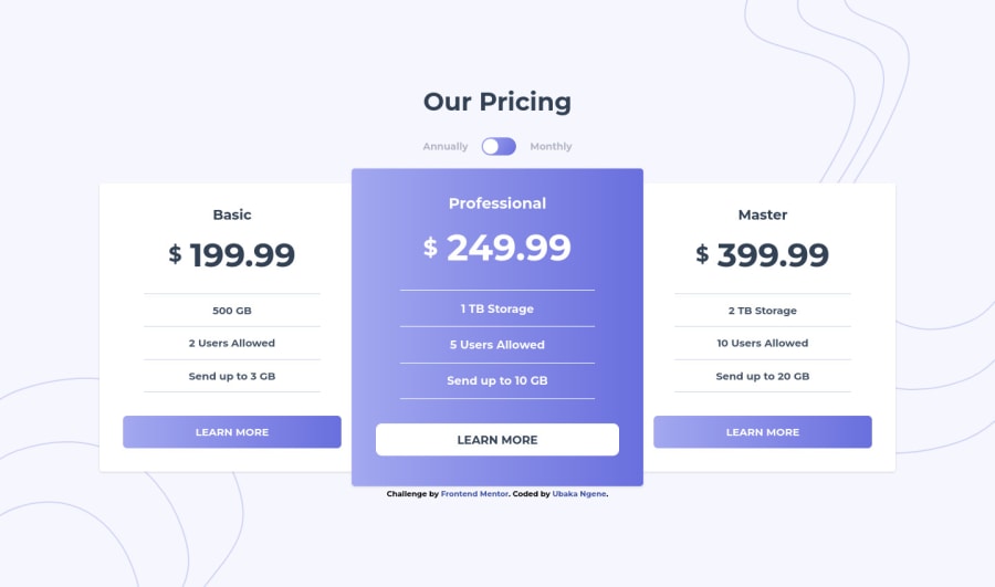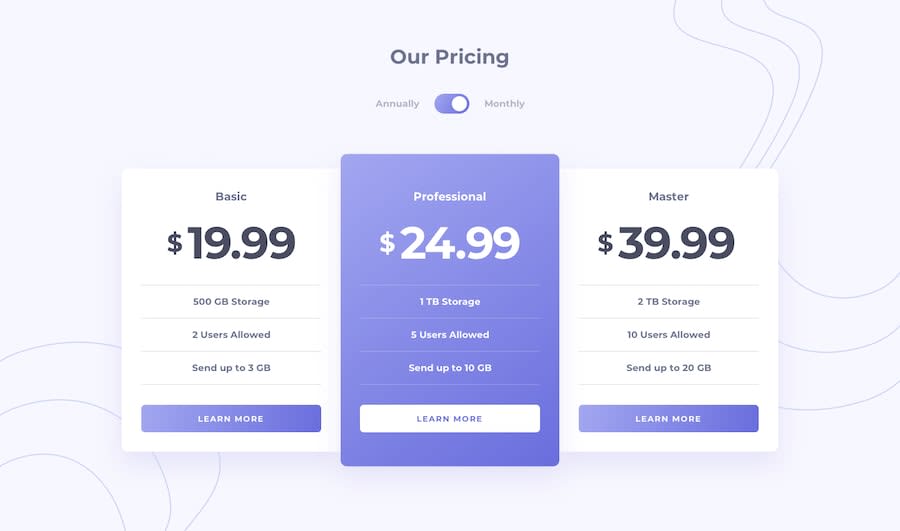
Pricing-Component with Toggle Master using HTML5 TailWindCss & React
Design comparison
Solution retrospective
Please I appreciate any advice regarding my submission that leads to my improving.
Community feedback
- @NikolaD93Posted almost 2 years ago
Hello there! 👋
Congrats for completing the challenge! 🙌
I have 3 suggestions for you:
1.Try not to put div element in a label, because it's not recommended for the div to be a child of a label.
2.Since you're using Tailwind css, use less CSS code, make sure to do everything with Tailwind.
3.When you have a repetitive component like a button, put it out of your main file and make a separate folder/file for it called Button.jsx. That will make your code cleaner and you'll separate logic from your main file.
Hope this was helpful for you!
Happy holidays! 🎉✌
Marked as helpful0
Please log in to post a comment
Log in with GitHubJoin our Discord community
Join thousands of Frontend Mentor community members taking the challenges, sharing resources, helping each other, and chatting about all things front-end!
Join our Discord
