Design comparison
SolutionDesign
Solution retrospective
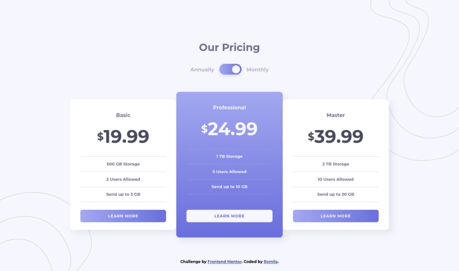
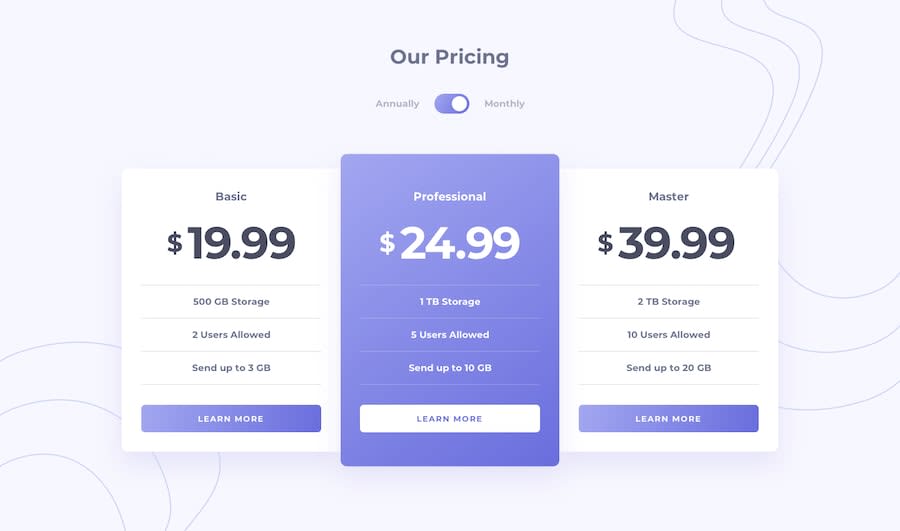
This challenge was really fun to do, especially creating the toggle button and making it function. Unfortunately, I couldn't make it accessible, but I am happy with the overall design in both mobile and desktop screen.
If you have any feedback/suggestions, feel free to share.
Community feedback
Please log in to post a comment
Log in with GitHubJoin our Discord community
Join thousands of Frontend Mentor community members taking the challenges, sharing resources, helping each other, and chatting about all things front-end!
Join our Discord
